Type is the single highest-signal surface in any design. The fingerprints below cover face choice, size, and the system-font escape hatch.
inter-as-display
Inter used as display font
high
font-family:\s*['"]?Inter['"]?[^;}]*[;}][^{]*(?:font-size:\s*([4-9]\d|\d{3,})px|\btext-(5xl|6xl|7xl|8xl|9xl)\b)
Why it's slop: Inter is a body font tuned for screen legibility at small sizes; deployed as display it reads as the default startup-landing fingerprint.
Fix: Pair Inter (body) with a distinctive display face such as Geist, Satoshi, Cabinet Grotesk, General Sans, Outfit, or a brand-specific variable sans.
font-system-only
System font stack with no chosen typeface
low
font-family:\s*(?:-apple-system|BlinkMacSystemFont)[^;]*;
Why it's slop: Falling back to the system stack alone with no chosen typeface gives up the chance to have any typographic identity.
Fix: Pick a real face such as Geist, Inter, Satoshi, IBM Plex Sans, Cabinet Grotesk. System stack is the absolute last fallback.
hero-text-arbitrary-90px
Arbitrary hero font size
medium
text-\[(?:9[0-9]|1[0-9]{2})px\]|font-size:\s*(?:9[0-9]|1[0-9]{2})px\b
Why it's slop: Arbitrary px values like text-[90px] or text-[112px] bypass the type scale and signal the size was picked by eye, not by system.
Fix: Extend the Tailwind theme scale or use clamp() for fluid hero typography. text-6xl/7xl/8xl exist for a reason.
Color is the loudest fingerprint surface. Indigo-to-blue gradients, purple glow shadows, rainbow gradient text: these are the visible-from-the-back-of-the-room AI tells.
purple-to-blue-gradient
Default purple-to-blue AI gradient
high
bg-gradient-to-[a-z]+\s+from-(purple|violet|fuchsia|indigo)-(400|500|600)\s+(?:via-[a-z]+-[0-9]+\s+)?to-(blue|sky|cyan)-(400|500|600)
Why it's slop: Purple-to-blue gradient on white is the strongest visual fingerprint of unconstrained model output and reads as template-marketplace AI slop.
Fix: Use a single restrained accent (Emerald, Electric Blue, Deep Rose, Amber) against neutrals. Keep gradient hue spread under 60 degrees if used at all.
gradient-text-rainbow
Multi-stop gradient text
medium
(?:bg-clip-text|background-clip:\s*text)[^"';]*(?:bg-gradient-to-[a-z]+\s+from-[a-z]+-[0-9]+\s+via-[a-z]+-[0-9]+\s+to-[a-z]+-[0-9]+)
Why it's slop: Three-stop rainbow text on a hero word is the strongest "AI hero" tell after the purple-to-blue gradient.
Fix: Use a single solid color for headlines. If gradient text is essential, two stops in analogous hues at modest saturation.
card-glow-purple-shadow
Purple glow shadow on cards
medium
box-shadow:[^;]*rgba?\(\s*(?:12[0-9]|13[0-9]|14[0-9])[^)]*\)|shadow-(?:purple|violet|fuchsia|indigo)-(?:400|500|600)
Why it's slop: Purple-tinted shadows on cards are the second-strongest "AI premium" fingerprint after the gradient itself.
Fix: Use neutral diffusion shadow like shadow-[0_20px_40px_-15px_rgba(0,0,0,0.08)]. Color comes from the surface, not the shadow.
tailwind-color-named-vague
Named Tailwind colors with no semantic token
low
\b(?:bg|text|border|ring|from|to|via)-(?:blue|red|green|yellow|purple|pink|indigo|orange)-(?:400|500|600)\b
Why it's slop: Raw bg-blue-500 / bg-purple-500 with no semantic token (primary, success, danger) signals the color system was never designed.
Fix: Define semantic tokens in tailwind.config or CSS custom properties: bg-primary, text-success, ring-accent. Map them once.
gradient-mesh-purple-pink
Purple-pink mesh gradient hero
medium
radial-gradient\([^)]*(?:purple|fuchsia|pink|violet)[^)]*\)|conic-gradient\([^)]*(?:purple|fuchsia|pink|violet)[^)]*\)
Why it's slop: Purple-to-pink mesh gradient is the second-most fingerprinted AI-hero pattern after blue-to-purple, pure "I generated a landing page" aesthetic.
Fix: Single accent against neutral canvas. If a hero needs depth, layer subtle noise or one low-saturation analogous gradient under 60deg hue spread.
dark-text-on-dark-card
Low-contrast text on card
high
(?:bg-zinc-[89]00|bg-slate-[89]00|bg-gray-[89]00|bg-black)[^"';]*(?:text-zinc-[5-7]00|text-slate-[5-7]00|text-gray-[5-7]00)
Why it's slop: Dark text token (zinc-500/600/700) on a dark surface fails WCAG AA 4.5:1 contrast and signals the dark mode pairing was never tested.
Fix: Test contrast on both themes. On dark surfaces use text-zinc-100 to text-zinc-300; reserve 500-700 for tertiary captions on light surfaces.
The model's default layout vocabulary is small: centered hero, three equal cards, hamburger menu, pill-shaped everything. These are the structural fingerprints.
three-equal-card-grid
Three equal cards in a row
high
(?:grid-cols-3|grid-template-columns:\s*repeat\(\s*3\s*,\s*(?:1fr|minmax))[^>]*>(?:\s*<[^>]*card[^>]*>[\s\S]*?</[^>]+>\s*){3}
Why it's slop: Three equal cards with three icons and three short paragraphs is the safest default the generator reaches for and the strongest layout fingerprint in AI-generated marketing surfaces.
Fix: Use asymmetric layouts: bento grids, 2-and-1 splits, 4 with one spanning width. Vary card size by content priority.
centered-everything-hero
Centered hero composition
medium
<(?:section|div|header)[^>]*class="[^"]*\bhero\b[^"]*"[^>]*>[\s\S]{0,800}?<h1[^>]*class="[^"]*\btext-center\b[^"]*"
Why it's slop: Centered headline + centered subtitle + centered button stack is the laziest hero composition and signals the generator picked it when it couldn't find a better layout.
Fix: Use left-aligned hero with editorial 7-5 or 8-4 grid split. Let the imagery earn its own column.
avatar-stack-overlapping
Generic overlapping avatar stack
medium
class="[^"]*-space-x-[0-9]+[^"]*"[^>]*>(?:\s*<(?:img|div)[^>]*class="[^"]*(?:avatar|rounded-full)[^"]*"[^>]*/?>\s*){3,}
Why it's slop: Three overlapping circular avatars in the nav as "our team" or "join 10k users" is a content-marketing template tell.
Fix: Use real customer logos, named testimonials with quotes, or specific signal like "Used by 312 engineering teams at Series-A companies."
pill-rounded-full-everywhere
rounded-full applied to everything
low
<button[^>]*class="[^"]*\brounded-full\b[^"]*"|<(?:input|textarea)[^>]*class="[^"]*\brounded-full\b
Why it's slop: rounded-full on every button and input is the iOS-tutorial fingerprint, signals the radius decision was skipped entirely.
Fix: rounded-full for pills, avatars, icon buttons only. Use rounded-md or rounded-lg for primary buttons; rounded-xl or rounded-2xl for cards.
nav-equal-hamburger-desktop
Hamburger menu on desktop
low
<(?:button|div)[^>]*aria-label="(?:menu|navigation|hamburger)"[^>]*>(?![\s\S]*?(?:md:hidden|lg:hidden))
Why it's slop: Hamburger on a wide viewport hides nav from users for no reason; signals the responsive breakpoint was skipped.
Fix: Show inline nav on md: and up. Hide the hamburger above that breakpoint with md:hidden.
Placeholder copy, fake testimonials, emoji-as-icon, Lorem ipsum that shipped. The model fills empty content slots with patterns it learned from tutorial code.
fake-name-john-doe
Generic placeholder names
medium
\b(?:John\s+Doe|Jane\s+Doe|John\s+Smith|Sarah\s+Chan|Test\s+User|Demo\s+User|Foo\s+Bar)\b
Why it's slop: John/Jane Doe and their cousins signal that nobody thought about who would actually use the product, immediate AI-generated-tutorial vibe.
Fix: Use plausible names that fit the target market, like Maya Iqbal, Adam Levin, Wen Zhang, Layla Haddad. Match region for regional products.
lorem-ipsum-leak
Lorem ipsum in shipping code
high
\b(?:Lorem\s+ipsum|consectetur\s+adipiscing|sed\s+do\s+eiusmod)\b
Why it's slop: Lorem ipsum in production source code is unshipped placeholder content: the most obvious draft-state leak.
Fix: Write real copy that makes a specific claim about the product. If you can't write it yet, mark the block with a TODO and a content owner.
emoji-in-ui
Emoji used as UI element
high
<(?:button|a|h[1-6]|span|div|p|li)[^>]*>[^<]*[emoji-range]
Why it's slop: Emojis render inconsistently across platforms, ignore brand color, and signal informality where SVG icons signal craft.
Fix: Inline SVG from Lucide, Feather, Phosphor, or Heroicons at 1.5-2px stroke with currentColor. Whitelist U+2713 check and U+2318 command only.
icon-emoji-stamp
Emoji used as icon stamp
high
class="[^"]*(?:icon|stamp|badge|achievement|reward)[^"]*"[^>]*>\s*[emoji-range]
Why it's slop: Emoji where an SVG icon belongs breaks brand color, scales poorly, and renders differently on every OS.
Fix: Inline SVG icon with currentColor and a consistent stroke width across the surface.
testimonial-fake-five-stars
Hardcoded five-star testimonial
high
(?:★{5}|★{5}|\*{5})|<(?:span|div|p)[^>]*class="[^"]*stars?[^"]*"[^>]*>\s*(?:★){4,}
Why it's slop: Five hardcoded stars next to a fake quote is the lowest-trust pattern on the web; users have learned to discount it on sight.
Fix: Show real, named, attributable testimonials with company affiliation and a specific outcome. No star count unless aggregated from a real review system.
Default durations, default curves, default bouncing arrows. Motion is the most-skipped design dimension and the easiest place to spot AI defaults.
timing-300ms-default
Default 300ms transition timing
low
(?:transition(?:-duration)?|animation-duration):\s*300ms\b|duration-300\b
Why it's slop: 300ms is the editor default; using it everywhere signals zero motion intent and reads as laziness to anyone who tunes animation curves.
Fix: Micro-interactions 150-220ms, complex transitions 250-400ms, exit 60-70% of entry. Pick durations that match the feel, not the default.
cubic-bezier-material-only
Material default easing everywhere
low
cubic-bezier\(\s*0?\.4\s*,\s*0\s*,\s*0?\.2\s*,\s*1\s*\)
Why it's slop: cubic-bezier(0.4, 0, 0.2, 1) is Material Design's default standard ease; using it as the only curve signals no taste decision was made.
Fix: Use cubic-bezier(0.16, 1, 0.3, 1) for premium exits, cubic-bezier(0.34, 1.56, 0.64, 1) for playful overshoot, or spring physics.
cta-arrow-rightward-bouncing
Bouncing arrow on CTA
medium
<(?:button|a)[^>]*>[^<]*(?:→|->|→)[^<]*</(?:button|a)>|class="[^"]*\banimate-bounce\b
Why it's slop: Bouncing arrow on a CTA is the desperate-attention pattern that signals the copy itself isn't doing the work.
Fix: Let the CTA copy carry the action (Start a 14-day trial, Read the deployment guide). If you need an arrow, use a static SVG that nudges 2-4px on hover.
Accessibility fingerprints aren't aesthetic; they're WCAG violations the model produces because nothing in the prompt forced it to think about screen readers. These get flagged as high severity because they're shipped bugs, not just bad taste.
inline-svg-no-aria
SVG without aria-label or aria-hidden
high
<svg(?![^>]*\baria-label=)(?![^>]*\baria-hidden=)(?![^>]*\brole="presentation")[^>]*>
Why it's slop: SVG with no aria-label and no aria-hidden is announced by screen readers as "graphic" with no context, a failure of WCAG 1.1.1.
Fix: Decorative SVG gets aria-hidden="true". Informative SVG gets aria-label="description" or aria-labelledby pointing to a title element.
button-no-type
Button missing type attribute
medium
<button(?![^>]*\btype=)[^>]*>
Why it's slop: A <button> inside a <form> without type="button" defaults to type="submit" and silently submits the form on every click.
Fix: Always set type="button" or type="submit" explicitly. The default is a footgun, not a feature.
img-no-alt
Image missing alt attribute
high
<img(?![^>]*\balt=)[^>]*/?>
Why it's slop: Missing alt breaks screen readers, SEO image indexing, and the broken-image fallback all at once, a WCAG 1.1.1 failure.
Fix: Every <img> gets alt. Decorative images get alt="" (empty). Informative images get a description a screen reader user would need.
link-onclick-no-href
Anchor with onClick but no href
high
<a(?![^>]*\bhref=)[^>]*\b(?:onClick|onclick)=
Why it's slop: An <a> without href is not focusable by default and is invisible to assistive tech; it looks like a link but behaves like a button.
Fix: Use <button> for actions. Use <a href="..."> for navigation. Never an anchor without href as a click target.
heading-skip-h1-h3
Skipped heading level
medium
<h1[^>]*>[\s\S]*?</h1>[\s\S]*?<h3[^>]*>(?![\s\S]*?<h2)
Why it's slop: Heading hierarchy gaps (h1 then h3, or h3 with no h1/h2 preceding) break the screen-reader landmark tree and the SEO outline.
Fix: h1 once per page; nest h2/h3/h4 in order. If you need a small visual heading without a logical level, use a styled <p> instead.
infinite-scroll-no-pagination
Infinite scroll without keyboard fallback
medium
(?:IntersectionObserver|useInfiniteScroll)[\s\S]{0,500}?(?:loadMore|fetchMore)(?![\s\S]{0,800}?<button[^>]*>(?:Load|Show|More))
Why it's slop: Pure infinite scroll with no "Load more" button locks out keyboard users and breaks back-button history, a WCAG 2.4 failure plus a usability one.
Fix: Ship infinite scroll AND a visible "Load more" button. The button is the keyboard path; the observer is the convenience layer.
Not strictly design, but they're the draft-state leaks that signal "this code wasn't reviewed." Inline styles, console.log, TODO comments, default shadcn tokens, lazy z-index, untyped any, unused blur.
inline-style-attribute
Inline style attribute
medium
<(?:div|span|p|section|article|h[1-6]|button|a|img)[^>]*\sstyle="[^"]+"
Why it's slop: Inline style= attributes bypass the design system, defeat caching, and signal the styling decision was made ad hoc.
Fix: Use Tailwind utilities, a CSS class, or a styled component. Reserve inline style for runtime-computed values (animated translate, dynamic CSS vars) only.
console-log-leak
console.log in component code
high
console\.(?:log|warn|debug|info)\s*\(
Why it's slop: console.log shipped to production leaks state to anyone with DevTools open and signals the build didn't go through a real review.
Fix: Remove debug logs before shipping. If you need structured logging, use a logger module that's tree-shaken out of production builds.
todo-fixme-comment
TODO or FIXME in shipping code
low
(?://|/\*|<!--)\s*(?:TODO|FIXME|XXX|HACK|WIP|REFACTOR)\b
Why it's slop: TODO/FIXME in shipping code is an unresolved promise to the reader and a draft-state leak.
Fix: Resolve the TODO before merge, or move it to the issue tracker with a specific owner and date.
any-type-leak
TypeScript any type
medium
:\s*any(?:\s*[;,)=\]>]|\s*$)|<any[,>]|as\s+any\b
Why it's slop: any defeats the type system and signals the type was never figured out; the code is JavaScript pretending to be TypeScript.
Fix: Use unknown for genuinely unknown shapes and narrow with type guards. Use a specific interface or generic for everything else.
blur-bg-only-decoration
Backdrop blur with no glass surface
low
(?:backdrop-blur(?:-(?:sm|md|lg|xl|2xl|3xl))?|backdrop-filter:\s*blur\([^)]+\))(?![^"';]*(?:bg-white/[0-9]|bg-black/[0-9]))
Why it's slop: Backdrop blur applied without a translucent surface behind it is GPU work for zero visual benefit: decoration, not design.
Fix: Pair backdrop-blur with a translucent fill like bg-white/70 or bg-zinc-950/60. Otherwise remove the blur entirely.
shadcn-default-everywhere
Default shadcn token block unmodified
low
--background:\s*0\s+0%\s+100%[\s\S]{0,200}--foreground:\s*222\.2\s+84%\s+4\.9%|--radius:\s*0\.5rem;
Why it's slop: The default shadcn HSL token block with --radius 0.5rem is recognizable in two seconds by anyone who has shipped one shadcn app.
Fix: Customize tokens at init: swap slate for zinc/stone, shift primary to a brand hue, set --radius to 0.625rem or 0.75rem.
arbitrary-z-index-9999
Lazy z-index value
medium
z-index:\s*(?:9999+|99999+|2147483647)\b|\bz-\[(?:9999+|99999+)\]
Why it's slop: z-index: 9999 is the "I gave up on the stacking system" value; it signals there's no z-scale token map and stacking bugs are coming.
Fix: Define a z-scale token set (z-base: 0, z-dropdown: 10, z-sticky: 20, z-modal: 50, z-toast: 60). Use the tokens, never a raw 9999.
How to run all 35 against your codebase
The full taxonomy ships in ux-skill v2's anti-pattern linter. The CLI runs every rule against your source files and exits non-zero if any high-severity fingerprint matches. Drop it into a pre-commit hook or a CI step.
Three install paths, same engine:
pip install uxskill: Python install. Adds the ux CLI to your PATH.npx uxskill@alpha lint .: no-install Node wrapper for Cursor / Windsurf / Copilot users./plugin marketplace add Laith0003/ux-skill: Claude Code marketplace path.
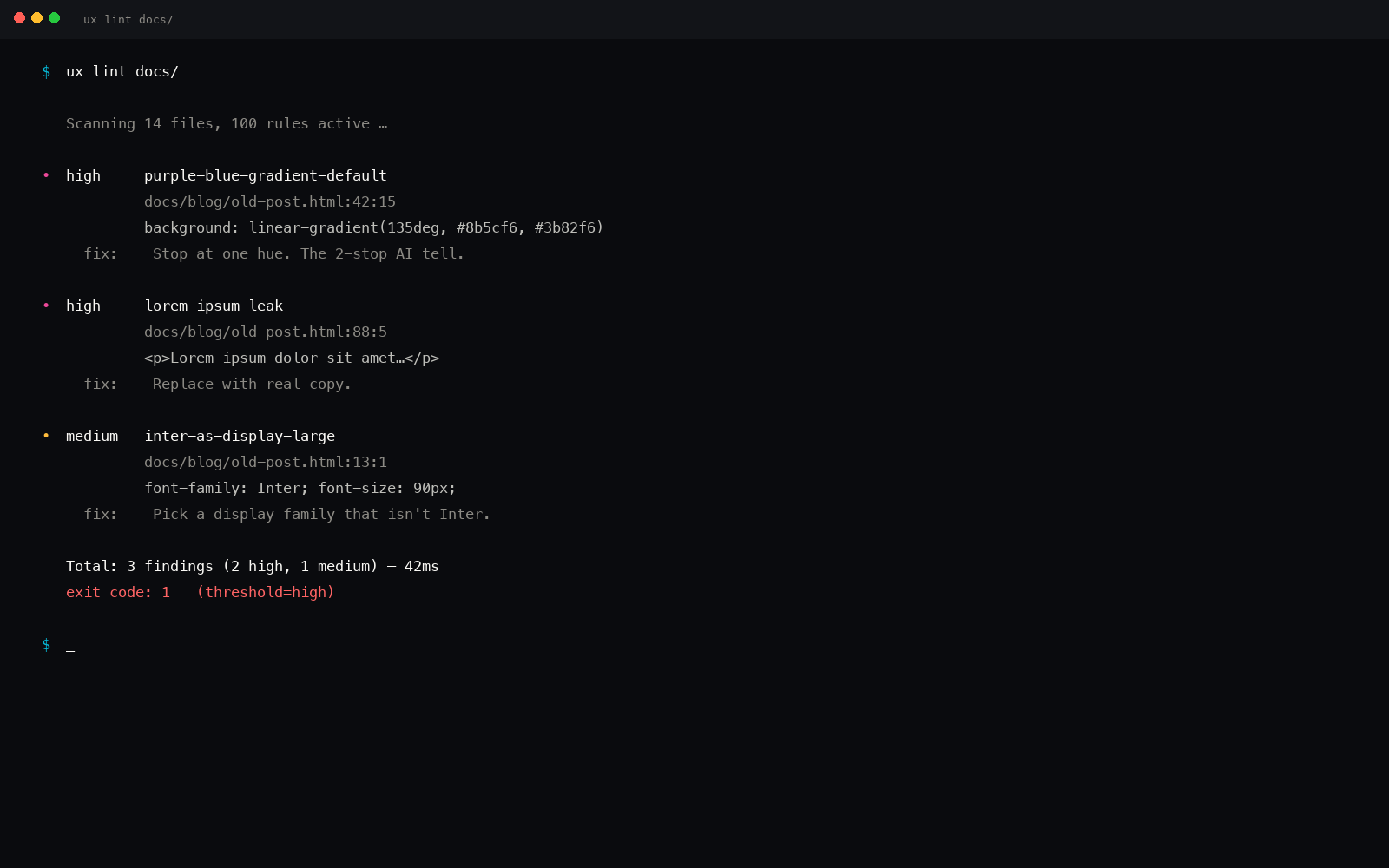
Once installed, ux lint --threshold high runs the 35 rules and exits 1 if any high-severity fingerprint is found. The full report is JSON, lined to file and line number. Fix flagged lines with ux fix.
Honesty card
35 fingerprints isn't every fingerprint.
The list above catches the most recognizable patterns we've seen across Claude Code, Cursor, Windsurf, v0, Bolt, and Aider output. It doesn't catch tone-of-voice slop, microcopy slop, or the layout patterns we haven't quantified yet.
The list grows. We add a rule whenever we spot a pattern we can write a regex for and a fix we can recommend. The source file is on GitHub and PRs are open.
Why a regex linter instead of a model judge
We chose deterministic regex over LLM-as-judge for two reasons. First, regex runs in milliseconds, in CI, with no API key. Second, regex is reproducible: the same input gives the same output on every run. LLM-as-judge for design is the right shape for ambiguous taste calls, but for "did the model ship Inter at 90px," a regex is faster, cheaper, and never flakes.
More on why the regex approach beats LLM judgment for fingerprint detection.
Every fingerprint above is a constraint the model didn't know to apply. The linter is what tells it the constraint was missed.
If you need to identify these fingerprints by eye rather than by code, the visual checklist at how to tell if a website was AI generated covers the nine most visible tells with no source access required.
Related reading