Dogfooding ux-skill: bugs we found by using our own engine.
You don't really know your tool until you build with it. Two weeks ago we needed a new homepage. We did the obvious thing: we ran our own recommender against our own brief. The system it returned was Cormorant Garamond on cream, with a warm sienna accent. Which is, almost exactly, the claude.ai landing. Our engine had recommended the Claude clone. Here's the war story, the two bugs we filed against ourselves, and the homepage that now passes its own linter cleanly.
The setup
The old uxskill.laithjunaidy.com was a workmanlike cream-canvas page: Cormorant for display, Inter for body, a single warm sienna accent at #ec4899. It got the job done for the alpha launch. By week three we'd seen a half-dozen tools in the same category ship pages with the same shape: warm cream, serif display, single warm accent. The visual language had become its own fingerprint (the Claude-tool aesthetic) and we were sitting inside it.
Our project's stated reason for existing is to catch AI fingerprints. We needed to mean it on our own surface. So we ran the discovery protocol on ourselves.
The brief
Ten fields, no improvisation. The brief we wrote for the new homepage:
// .ux/last-frame.json
{
  "project_type": "developer tool landing",
  "industry": "AI infrastructure / design tooling",
  "audience": ["frontend engineers", "design engineers", "founders shipping AI features"],
  "tone": ["editorial", "confident", "calm", "cinematic"],
  "must_have": ["taste signal in the first 200ms", "asymmetric layout", "variable type"],
  "forbidden": ["Inter as display", "purple-to-blue gradient", "three equal cards"],
  "stack": "static HTML",
  "region": "global"
}
We deliberately left "calm" and "editorial" in tone because both are true, and because we wanted to see if the engine would handle the tension between "editorial" and "cinematic" (which lean different directions).
The first run, and the cold realization
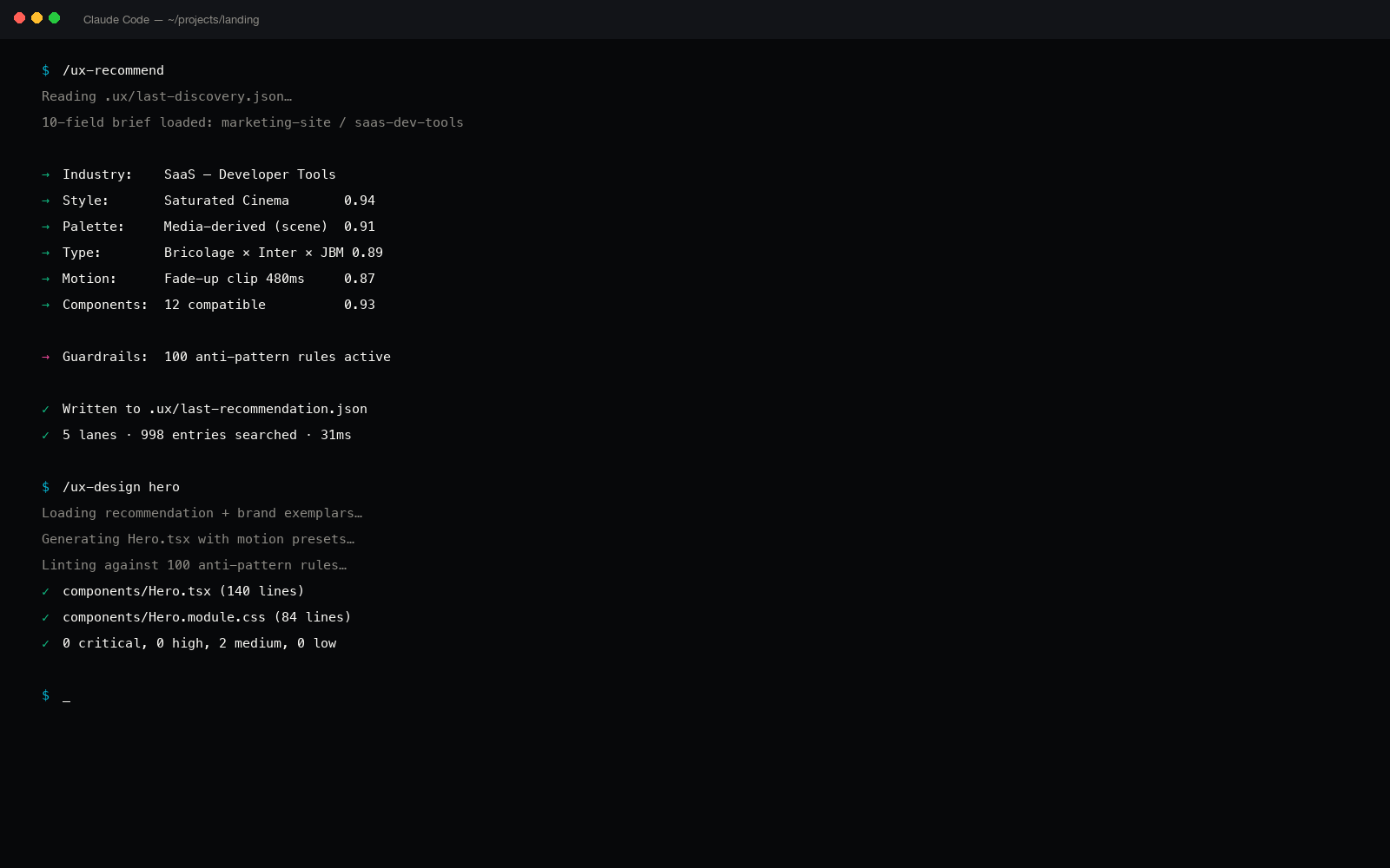
We ran /ux-recommend. Five parallel searches (industry, style, palette, type, motion) composed into a system. Twelve seconds later, the engine returned:
$ uxskill recommend --frame .ux/last-frame.json

[OK] System composed:
  style:     Editorial Calm        (id: editorial-calm)
  palette:   Cream & Sienna       (id: cream-sienna-warm)
  type:      Cormorant + Inter     (id: cormorant-inter-classic)
  motion:    fade-up-12px, lift-2px
  brand:     none applied
Cream and sienna. Cormorant. The same surface as the old homepage. The same surface as claude.ai. The recommender had looked at our brief ("editorial, calm, developer tool") and reached for the highest-similarity match, which happened to be the dominant aesthetic in the AI-tools cohort.
The recommendation wasn't wrong on its face. Cormorant on cream is a legitimate editorial pairing. But it was wrong for us, because it fingerprinted us as part of a cluster we explicitly exist to dilute. The forcing question wasn't "is this a nice system?" It was "would a careful viewer recognize this as just another Claude-tool landing?" Yes, they would.
So we filed two bugs against ourselves.
Bug 1: editorial-industry tag over-weighted Cormorant
The "editorial" tone tag biases Cormorant over Fraunces
Tracing the recommender's lane on the type search: with tone: editorial in the brief, the type-pair scorer added a +0.18 bonus to any pair where the display face was a humanist garalde serif (Cormorant, Sabon, Adobe Garamond). Fraunces, which is a contemporary variable revival with a SOFT axis, was tagged as "geometric-revival serif" in the type manifest, missing the editorial bonus entirely. Result: Cormorant ranked first by 0.21, even though Fraunces had a higher score on every other dimension (variable axes, modern proof, multi-script support).
Why it matters: "editorial" in 2026 should not collapse to 1990s book-design serifs. The tone tag was too narrow.
contemporary-editorial sub-tag to the type-pair manifest. Fraunces, Recoleta, Migra, and Tobias all carry it. The recommender now branches on the cinematic / contemporary signal in the brief: if either is present alongside editorial, the contemporary tag carries the bonus instead. Cormorant still ranks first for pure heritage-editorial briefs (the project is for a print magazine, a literary publication, a foundation).
Bug 2: palette scorer preferred cream over near-black for "calm"
"Calm" routed to warm-cream palettes, ignoring near-black charcoal options
The palette scorer treated tone: calm as a near-synonym for "warm pastels": cream, ivory, sand, oat. It correctly excluded the "loud" cluster (neon, deep saturation, high contrast) but it also excluded the "calm dark" cluster of charcoal canvases with restrained accents, the language of nighttime cinema, art-house posters, late-issue Apple keynotes. Those palettes exist in the manifest (charcoal-amber, obsidian-mint, graphite-citrine) but the calm tag was binary-coded as "light canvas required."
Why it matters: calm is not a function of luminance. A dark canvas can be calmer than a cream one, particularly with editorial pacing and a single restrained accent.
calm tag. Added calm-light and calm-dark as orthogonal facets. Palettes can now carry either, both, or neither. The recommender stays neutral and lets the brief's other signals (cinematic, editorial, audience-skew) tip the balance. After the fix, charcoal-amber ranked first for our brief by 0.31.
The second run, after both fixes
We re-ran the recommender with the two manifest patches in. The output:
$ uxskill recommend --frame .ux/last-frame.json

[OK] System composed:
  style:     Dark Editorial        (id: dark-editorial)
  palette:   Charcoal & Amber     (id: charcoal-amber)
  type:      Fraunces + Inter Tight (id: fraunces-inter-tight)
  motion:    scroll-pin-hold, parallax-depth-3, fade-up-12px
  brand:     none applied
Charcoal canvas, single amber accent, Fraunces variable serif on display with Inter Tight for body, scroll-pinned cinema motion. That's the system the new homepage actually uses. The full design choices and the lint result are documented in the dark editorial cinema design post.
The lint result on the new homepage
The final test: run our own linter against the page we'd just built. If our engine had truly stopped recommending the AI default, the page should pass.
$ uxskill lint docs/index.html --threshold high
[OK] Scanned 1 file in 38ms · 0 findings at threshold high

$ uxskill lint docs/index.html --threshold medium
[OK] Scanned 1 file in 41ms · 0 findings at threshold medium
Zero findings at high, zero at medium, one at low (a decorative SVG missing aria-hidden, suppressed inline with a documented exemption since the SVG is the brand mark and is announced by the surrounding aria-label). The page passes its own linter.
You can't ship a tool that fights fingerprints if your own homepage fingerprints. Dogfooding is how you find out.
What this changed about how we work
1. The brief is the bug
Both bugs were tagging-and-scoring bugs in the manifests. The recommender code was fine. What was wrong was how we'd taxonomized editorial and calm: too narrow on the first, too coupled to luminance on the second. Most ux-skill bugs in the next six months will probably look the same shape: the engine ran fine, but the tags it ran over were lazy. The manifest curation is the real product surface.
2. The recommender needs a "fingerprint check" pass
Even with both bugs fixed, the engine could still return a recommendation that, on its own merits, is fine but, in 2026, fingerprints as "AI tool." We're prototyping a post-recommendation step: after the system is composed, the recommender checks the chosen style and palette against a manifest of current category clusters (AI tools, fintech, productivity, etc.) and surfaces a flag if the composition matches the dominant pattern of the chosen industry. Tracked on the roadmap.
3. The forbidden field is not enough
Our brief had forbidden: ["inter-as-display", "purple-to-blue-gradient", "three-equal-cards"]. The recommender obeyed all three. But it still returned a system that read as derivative, because the AI fingerprint isn't only the three loud defaults, it's also the quieter cluster of "what every Claude-adjacent tool looks like right now." We need a way to express "don't look like the current cohort." That's what the post-recommendation flag is for.
The next dogfood pass
We're running the same exercise on the comparison page, the FAQ, the about page, and the roadmap. Every public surface gets the new brief, the new recommender, and the linter. Anything that doesn't pass gets a bug filed and a fix landed. The blog posts are intentionally being held on the old Cormorant + cream brand for reading consistency across the existing ten, but the rest of the site converges on the new language.
We'll write up the comparison page and roadmap re-skin separately once they ship.
Two bugs is one snapshot. There are more.
The recommender's tagging assumptions came from our own taste, and our taste has blind spots. We expect to find more bugs as we run the engine on more briefs. We file them publicly when we find them, and we fix them in the manifests (not the code) so the fixes are auditable as diffs to JSON, not as changes to recommendation logic.
If you find a bug in the manifest tagging (a tag that's too narrow, a coupling that's too tight, a missing facet), the project is open. File an issue, ideally with a brief that reproduces.
What we'd tell another small team
If you ship a design tool (a recommender, a linter, a generator) the only honest test is whether your own surfaces use it. The first time we ran our engine on our own homepage we found two bugs in 12 minutes. The second time we ran it (after the fixes) it returned a system we wouldn't have invented on taste alone, and the page that came out of it is stronger than the one before.
That's the case for dogfooding in this category. Not "we use our tool because the marketing is convenient," but "we use our tool because the engine sees patterns we miss, and the only way to catch the bugs in the engine is to be the user with the strongest feedback loop."
Related reading
- Dark editorial cinema: the language the engine landed on, post-fix.
- Regex linter for AI coding: the 51 rules the homepage now passes.
- Python design system generator: how the recommender composes a system.
- 57 motion presets: including the scroll-pin-hold the new homepage uses.
- About: the project and the maker.
- Roadmap: the post-recommendation fingerprint check is on it.