#anchor-no-href-as-button
HIGH
A11y
Anchor styled as button without href
Why badAn <a class="btn"> without href is not focusable, not in the tab order, and not announced as a link - looks like a button but behaves like nothing.
FixUse <button> for actions, <a href="..."> for navigation. If the destination is unknown until runtime, render a button or set href="#" with preventDefault.
<a[^>]+class=['"][^'"]*btn[^'"]*['"](?![^>]+href)
link
#aria-live-polite-on-error
HIGH
A11y
aria-live='polite' on a critical error region
Why badaria-live='polite' on an error region tells screen readers to wait until the user is idle before announcing - the user submits a broken form, walks away to next field, and the failure announcement may be delayed or skipped entirely. Critical errors that block the flow need to interrupt.
FixUse aria-live='assertive' (or role='alert', which implies assertive) for blocking validation errors and destructive-action failures. Reserve aria-live='polite' for non-critical status text (saved, syncing, last updated).
(?:className|class)\s*=\s*['"][^'"]*\b(?:error|danger|alert-danger|toast-error|notification-error)\b[^'"]*['"][^>]*\baria-live\s*=\s*['"]polite['"]|\baria-live\s*=\s*['&quo
link
#cursor-not-allowed-no-visual
HIGH
A11y
cursor: not-allowed with no visible disabled state
Why badcursor: not-allowed in a rule that has no opacity reduction, no muted color, no border tweak, and no pointer-events: none signals the disabled state was set by an AI that knew the cursor convention but never designed the actual visual. The button still looks fully active, screen reader users hear no announcement, and touch users see no change at all - the not-allowed cursor never appears.
FixA disabled control needs three signals: visual (opacity 0.5 + maybe muted color or removed border), behavioral (pointer-events: none, or aria-disabled='true' + handle the click), and announcement (aria-disabled on non-button elements; the disabled attribute on actual buttons does both). The cursor is the smallest of these three - never the only one.
\{[^}]*cursor\s*:\s*not-allowed\s*;(?:(?!opacity|pointer-events|filter|background|color|border|disabled)[^}])*\}
link
#generic-alt-image-photo-icon
HIGH
A11y
Generic alt text: image / photo / picture / icon
Why badalt='image' or alt='photo' tells the screen reader nothing the user did not already know from the tag name - it is technically present but functionally absent. WCAG 1.1.1 demands meaningful equivalents, not the word 'image'.
FixDescribe what the image conveys: 'Stripe Dashboard with revenue chart', 'team standing in front of the office'. For purely decorative images, use alt='' so the screen reader skips them.
<img[^>]*\balt\s*=\s*['\"](?:image|photo|picture|icon|graphic|illustration|pic|img)['\"]
link
#generic-alt-untitled-screenshot-logo-banner
HIGH
A11y
Generic alt text: untitled / screenshot / logo / banner
Why badalt='untitled' / 'screenshot' / 'logo' / 'banner' is the CMS/Webflow/SaaS default fingerprint - signals the alt field was never filled in and the default leaked through. Screen reader users hear the same word for every image on the page.
FixName the subject: alt='ux-skill logo', alt='Stripe pricing page screenshot from Mar 2026', alt='hero banner: model writes the code, designer sets the rules'. Specific enough that someone could find the image from the alt alone.
<img[^>]*\balt\s*=\s*['\"](?:untitled|screenshot|logo|banner|hero|placeholder|asset|file|upload|attachment)['\"]
link
#hover-only-card-actions
HIGH
A11y
Card actions revealed only on hover
Why badCard actions hidden at opacity: 0 and revealed only on :hover are invisible to touch users, keyboard users, and anyone using assistive tech - the action does not exist for most of your audience. WCAG 2.1.1 and 1.4.13 failure.
FixShow card actions persistently at reduced visual weight (lower opacity, smaller scale, secondary color), or make them reachable via a visible focus-state. Hover is a progressive disclosure, never the only path.
\.(?:card|item|tile)[^{]*\{[^}]*\}[\s\S]{0,300}?\.(?:card|item|tile)[^:]*:hover\s+(?:\.[^{\s]+|[a-z]+)[^{]*\{[^}]*opacity\s*:\s*1|opacity\s*:\s*0[^}]*\}[\s\S]{0,300}?:hover[\s\S]{0,100}?opacity\s*:\s*1
link
#iframe-without-title
HIGH
A11y
<iframe> missing title attribute
Why badAn <iframe> with no title is announced to screen readers as 'frame' with no description of what it contains - blank, unactionable. WCAG 2.4.1 (Bypass Blocks) and 4.1.2 (Name, Role, Value) fail. Every embedded video, payment widget, map, or ad triggers this.
FixAlways set title='Stripe payment form' / 'YouTube video: product tour' / 'Google Maps: office location'. The title should describe the frame's purpose, not just say 'iframe' or 'embed'.
<iframe(?![^>]*\btitle\s*=)[^>]*>
link
#img-no-alt
HIGH
A11y
Image missing alt attribute
Why badMissing alt breaks screen readers, SEO image indexing, and the broken-image fallback all at once - WCAG 1.1.1 failure.
FixEvery <img> gets alt. Decorative images get alt="" (empty). Informative images get a description a screen reader user would need.
<img(?![^>]*\balt=)[^>]*/?>
link
#inline-svg-no-aria
HIGH
A11y
SVG without aria-label or aria-hidden
Why badSVG with no aria-label and no aria-hidden is announced by screen readers as 'graphic' with no context - failure of WCAG 1.1.1.
FixDecorative SVG gets aria-hidden="true". Informative SVG gets aria-label="description" or aria-labelledby pointing to a title element.
<svg(?![^>]*\baria-label=)(?![^>]*\baria-labelledby=)(?![^>]*\baria-hidden=)(?![^>]*\brole="presentation")[^>]*>
link
#lang-attribute-missing
HIGH
A11y
<html> without lang attribute
Why bad<html> without a lang attribute leaves screen readers guessing which pronunciation engine to use - Arabic content gets read in English phonemes, English headings get read with Spanish stress patterns, and automatic translation breaks. WCAG 3.1.1 Level A failure.
FixAdd lang="en" (or your primary locale) to <html>. For multilingual pages, override per-section with lang="ar" on RTL blocks. Pair with dir="rtl" for Arabic/Hebrew layouts.
<html(?![^>]*\blang\s*=)[^>]*>[\s\S]{0,800}?<head\b
link
#link-onclick-no-href
HIGH
A11y
Anchor with onClick but no href
Why badAn <a> without href is not focusable by default and is invisible to assistive tech - it looks like a link but behaves like a button.
FixUse <button> for actions. Use <a href="..."> for navigation. Never an anchor without href as a click target.
<a(?![^>]*\bhref=)[^>]*\b(?:onClick|onclick)=
link
#link-without-href
HIGH
A11y
<a> element without an href attribute
Why badAn anchor with no href is not focusable, not in the tab order, and not announced as a link by assistive tech - it's a styled <span> that the dev mistook for a button. Common AI shortcut for 'I want a clickable thing but the route isn't ready yet.'
FixIf the element triggers an action, use <button>. If it navigates, set href='...' (even href='#' with preventDefault during loading is better than no href at all). Pure anchor targets (legacy bookmarks) use name= or id= and are exempt.
<a(?![^>]*\bhref=)(?![^>]*\bname=)(?![^>]*\bid=)(?![^>]*\bxlink:href=)\s[^>]*>
link
#meta-refresh-redirect
HIGH
A11y
<meta http-equiv='refresh'> redirect
Why bad<meta http-equiv='refresh'> auto-redirects without user consent, breaks back-button navigation, disorients screen reader users, and is a documented WCAG 2.2.1 (Timing Adjustable) and 3.2.5 (Change on Request) fail. Google also down-ranks pages that use it for redirects.
FixFor a true redirect, do it server-side (301 / 302). For client-side route changes, use the router's navigate() method tied to a user action. Never use meta-refresh for the 'you'll be redirected in 5 seconds' pattern - use an inline link the user clicks.
<meta[^>]+http-equiv\s*=\s*['"]refresh['"][^>]*>
link
#overflow-hidden-on-html
HIGH
A11y
overflow: hidden applied to <html>
Why badoverflow: hidden on the root <html> element breaks browser scroll restoration on back-navigation, disables 'skip to content' anchor scrolling for screen-reader users, kills smooth-scroll APIs, and prevents the URL bar from collapsing on mobile. It is almost always a hack to suppress a horizontal-overflow bug that should be fixed at the source.
FixFind the actual overflowing child (often a 100vw image, fixed-position element, or oversized inline-block) and constrain it. If you genuinely need a scroll-lock for a modal, toggle the class on <body> via JS for the lifetime of the modal - never permanently on <html>.
(?:^|[\s,}>+~])html\s*\{[^}]*overflow(?:-[xy])?\s*:\s*hidden
link
#placeholder-as-label
HIGH
A11y
Input placeholder used as the only label
Why badPlaceholders disappear on focus, sit at low contrast by default, and are not announced consistently by assistive tech - using one as the only label fails WCAG 3.3.2.
FixAlways pair <input> with a <label for="id"> or aria-label. Placeholder is for an optional hint, never the field name.
<input(?![^>]*\baria-label=)(?![^>]*\baria-labelledby=)[^>]+placeholder=
link
#pointer-events-none-on-link
HIGH
A11y
<a> with pointer-events: none and no aria-disabled
Why badAn <a> tag with pointer-events: none and no aria-disabled='true' is announced to screen readers as a fully working link, takes a position in the tab order, and gives keyboard users an Enter-key path to nothing - the click is silently swallowed. This is the AI shortcut for 'disabled link' that breaks every assistive technology user while looking fine to the designer.
FixIf the link is permanently inactive, render a <span> with the same visual treatment instead of an <a>. If it's temporarily disabled (loading, gated state), add aria-disabled='true' AND tabindex='-1' AND a handler that returns early - or remove the href until the action becomes available.
<a(?![^>]*\baria-disabled\s*=)[^>]+(?:class\s*=\s*['"][^'"]*\bpointer-events-none\b[^'"]*['"]|style\s*=\s*['"][^'"]*pointer-events\s*:\s*none[^'"]*['"]
link
#role-button-on-anchor-without-href
HIGH
A11y
<a role='button'> with no href
Why bad<a role='button'> with no href is the worst of both worlds - the link semantics are overridden, the element is not focusable (no href = not in tab order), and the WAI-ARIA promise of 'this behaves like a button' is silently broken. WCAG 4.1.2 fail.
FixJust use <button type='button'>. If the design demands link-text styling, give the <button> the same classes as your text-link recipe. Never patch a semantically wrong anchor with role='button' - replace it.
<a(?![^>]*\bhref=)[^>]*\brole\s*=\s*['"]button['"][^>]*>
link
#select-without-label
HIGH
A11y
<select> with no associated <label> or aria-label
Why badA <select> with no id (so <label for=> cannot reach it), no aria-label, and no aria-labelledby is announced to screen readers as just 'combobox, 1 of 3' with no clue what it controls. WCAG 1.3.1 / 4.1.2 fail.
FixEither give the <select> an id and reference it from <label for='...'>, or set aria-label='Country' / aria-labelledby='country-heading'. Don't rely on a placeholder option ('Select a country...') as the label - placeholder options are not labels.
<select(?![^>]*\baria-label=)(?![^>]*\baria-labelledby=)(?![^>]*\bid=)[^>]*>
link
#tabindex-positive
HIGH
A11y
Positive tabindex value
Why badtabindex='1' (or any positive value) pulls the element out of source order and into a synthetic tab sequence, so the keyboard tab order no longer matches the visual or DOM order. Any new element added to the page disrupts the explicit numbering - WCAG 2.4.3 (Focus Order) fail and an ongoing maintenance trap.
FixUse tabindex='0' to make a non-interactive element focusable, tabindex='-1' to remove a focusable element from the tab order (still programmatically focusable). Source order should match tab order; fix layout with CSS, not synthetic tabindex.
\btabindex\s*=\s*['"][1-9][0-9]*['"]
link
#target-blank-no-noopener
HIGH
A11y
target="_blank" without rel="noopener noreferrer"
Why badtarget="_blank" without rel="noopener" lets the opened page access window.opener and rewrite the source URL - a tabnabbing vector. It also blocks the browser's tab-recycle optimization. A11y-adjacent because hijacked navigation breaks the user's mental model of where they are.
FixAlways pair target="_blank" with rel="noopener noreferrer". Better: ask whether the link actually needs a new tab - in-page navigation respects user choice and back-button history.
<a[^>]+target\s*=\s*['"]_blank['"](?![^>]+rel\s*=\s*['"][^'"]*(?:noopener|noreferrer))
link
#tooltip-on-required-info
HIGH
A11y
Load-bearing copy hidden in a title attribute
Why badA title attribute carrying 60+ characters of real content is hover-only - invisible on touch, inconsistently announced by screen readers, undiscoverable on keyboard. The information is effectively missing for most users.
FixMove the content into the visible flow or into an aria-describedby popover that is reachable by keyboard and touch. Reserve title for one-line, optional clarifications.
title=\"[A-Z][^\"]{60,}\"
link
#video-without-captions
HIGH
A11y
<video> element without <track kind='captions'>
Why badA <video> with no captions <track> is inaccessible to Deaf and hard-of-hearing users, fails WCAG 1.2.2 (Captions, Prerecorded) at AA, and is unusable in any sound-off context (open-plan office, public transport, autoplay-muted social feeds).
FixProvide at least one <track kind='captions' src='cap.vtt' srclang='en' label='English' default> child for every <video>. Subtitles (kind='subtitles') translate dialog but skip sound effects; captions include both - WCAG asks for captions, not subtitles.
<video\b(?![^>]*>(?:(?!</video>)[\s\S])*<track[^>]+\bkind\s*=\s*['"]captions['"])[^>]*>
link
#chrome-y-multi-stop-gradient
HIGH
Color
Chrome-y multi-stop gradient
Why badThree-plus color stops in a linear-gradient is the v0 / Cursor / generic-AI default; reads as chrome-y template output rather than a deliberate brand decision.
FixUse a two-stop gradient (or a single solid) with hue spread under 60 degrees. If depth is needed, layer a low-opacity overlay instead of stacking stops.
linear-gradient\([^)]+,[^)]+,[^)]+,[^)]+,
link
#dark-text-on-dark-card
HIGH
Color
Low-contrast text on card
Why badDark text token (zinc-500/600/700) on a dark surface fails WCAG AA 4.5:1 contrast and signals the dark mode pairing was never tested.
FixTest contrast on both themes. On dark surfaces use text-zinc-100 to text-zinc-300; reserve 500-700 for tertiary captions on light surfaces.
(?:bg-zinc-(?:[89]00|950)|bg-slate-(?:[89]00|950)|bg-gray-(?:[89]00|950)|bg-black|background:\s*#0[0-9a-f]{5})[^"';]*(?:text-zinc-(?:[5-7]00)|text-slate-(?:[5-7]00)|text-gray-(?:[5-7]00)|color:\s*#[4-6][0-9a-f]{5})
link
#gradient-on-text-rainbow
HIGH
Color
Rainbow gradient on display text
Why badbackground-clip: text on a multi-stop linear-gradient is the AI hero's chrome-y rainbow word - the loudest signal that no taste decision was made on color.
FixUse one solid color on display text. If gradient text is essential, two stops in analogous hues at modest saturation, never three-plus rainbow stops.
background-clip\s*:\s*text[^;]*;\s*background[^;]*linear-gradient
link
#purple-to-blue-gradient
HIGH
Color
Default purple-to-blue AI gradient
Why badPurple-to-blue gradient on white is the strongest visual fingerprint of unconstrained model output and reads as template-marketplace AI slop.
FixUse a single restrained accent (Emerald, Electric Blue, Deep Rose, Amber) against neutrals; keep gradient hue spread under 60 degrees if used at all.
bg-gradient-to-[a-z]+\s+from-(purple|violet|fuchsia|indigo)-(400|500|600)\s+(?:via-[a-z]+-[0-9]+\s+)?to-(blue|sky|cyan)-(400|500|600)|linear-gradient\([^)]*#(7c3aed|8b5cf6|a855f7|6366f1)[^)]*#(3b82f6|2563eb|0ea5e9)[^)]*\)
link
#cta-text-read-more
HIGH
Content
Generic CTA text: Read more / View more / See more
Why bad'Read more' / 'View more' / 'See more' tells the user nothing about the destination and fails screen-reader scan-by-link mode (where users hear only link text). Every card on the page reads the same.
FixMake link text describe the destination: 'Read the launch post', 'See all 152 rules', 'View the changelog'. The link should make sense out of context.
<(?:a|button)[^>]*>\s*(?:Read\s+more|View\s+more|See\s+more|Find\s+out\s+more|More\s+info|Discover\s+more)\s*</(?:a|button)>
link
#emoji-in-ui
HIGH
Content
Emoji used as UI element
Why badEmojis render inconsistently across platforms, ignore brand color, and signal informality where SVG icons signal craft.
FixInline SVG from Lucide, Feather, Phosphor, or Heroicons at 1.5-2px stroke with currentColor. Whitelist U+2713 check and U+2318 command only.
<(?:button|a|h[1-6]|span|div|p|li)[^>]*>[^<]*(?:[\U0001F300-\U0001F9FF]|[\U0001F600-\U0001F64F]|[\U0001F680-\U0001F6FF]|[\u2600-\u26FF]|[\u2700-\u27BF])
link
#filler-marketing-verbs
HIGH
Content
Filler marketing verb in headline
Why badElevate, Seamless, Unleash, Revolutionize, Empower, Supercharge, Transform - the unmistakable fingerprint of unedited marketing copy generated without a real product in mind.
FixName the specific action and the specific outcome. Cut the verb if it isn't carrying weight. The reader knows what the product does only if you say what the product does.
<h[1-3][^>]*>[^<]*(?:Elevate|Seamless|Unleash|Revolutionize|Empower|Supercharge|Transform)[^<]*<
link
#generic-cta-text
HIGH
Content
Generic CTA text (Click here, Learn more)
Why badClick here / Learn more / Get started reveals nothing about the destination and fails screen-reader scan-by-link - users hear a list of identical labels with no context.
FixName the specific action: Read pricing, Start free trial, View dashboard, Open API docs. The link text should make sense out of context.
<(?:a|button)[^>]*>\s*(?:Click here|Learn more|Get started)\s*</(?:a|button)>
link
#icon-emoji-stamp
HIGH
Content
Emoji used as icon stamp
Why badEmoji where an SVG icon belongs breaks brand color, scales poorly, and renders differently on every OS.
FixInline SVG icon with currentColor and a consistent stroke width across the surface.
class="[^"]*(?:icon|stamp|badge|achievement|reward)[^"]*"[^>]*>\s*(?:[\U0001F300-\U0001F9FF]|[\u2600-\u27BF]|[\U0001F600-\U0001F6FF])
link
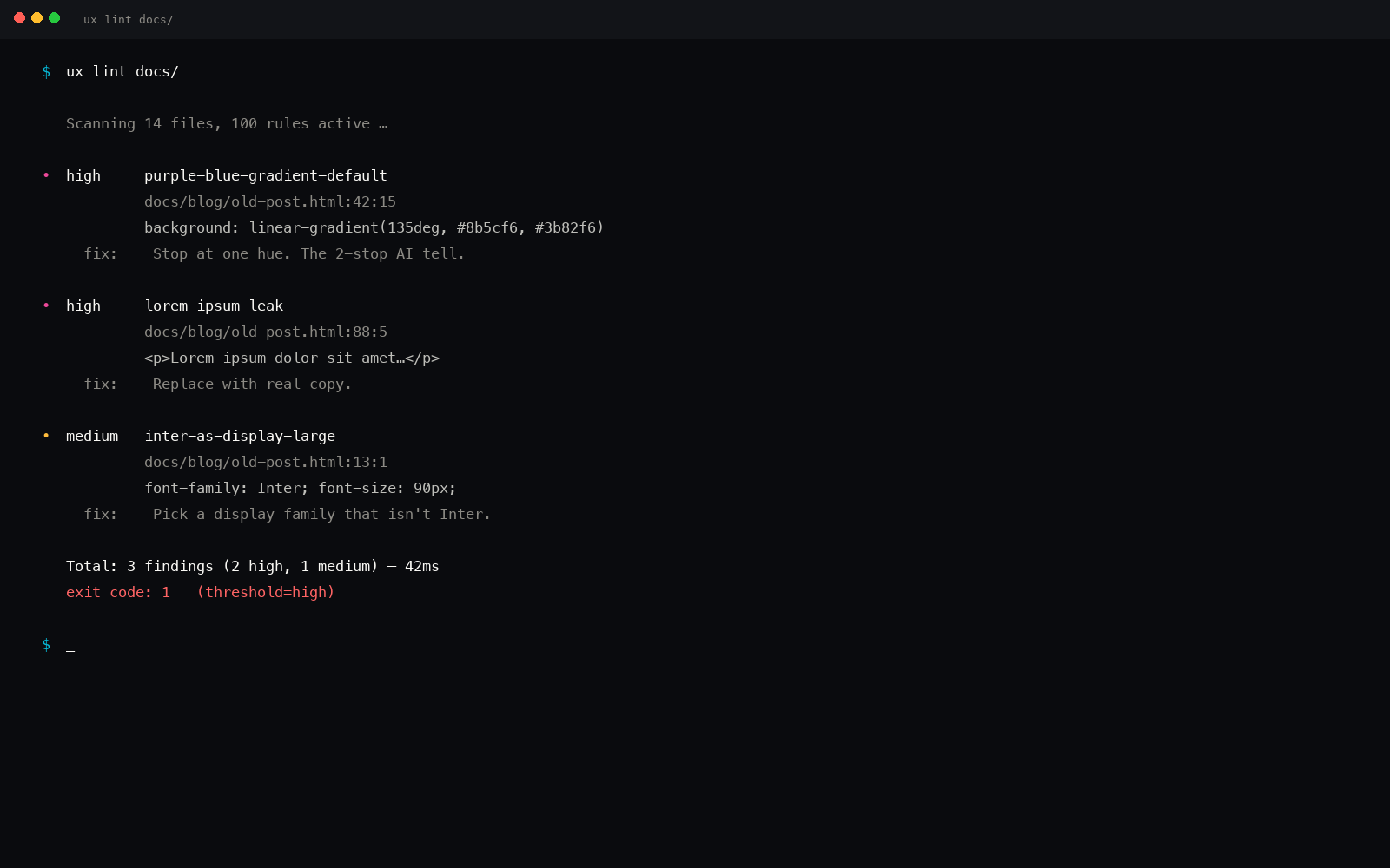
#lorem-ipsum-leak
HIGH
Content
Lorem ipsum in shipping code
Why badLorem ipsum in production source code is unshipped placeholder content - the most obvious draft-state leak.
FixWrite real copy that makes a specific claim about the product. If you can't write it yet, mark the block with TODO and a content owner.
\b(?:Lorem\s+ipsum|lorem\s+ipsum\s+dolor|consectetur\s+adipiscing|sed\s+do\s+eiusmod)\b
link
#picsum-photos-seed
HIGH
Content
picsum.photos lorem-picsum placeholder
Why badpicsum.photos serves random rotating Lorem Picsum stock images - the design never settles, and the same hero photo on a Stripe-like landing page is an instant tell that the visuals were never chosen.
FixCommission, license, or generate the real image. If you need a stable placeholder, generate one once and self-host it under /assets so it stops drifting between deploys.
\b(?:https?:)?//picsum\.photos/
link
#placeholder-as-pricing
HIGH
Content
Default AI pricing tier amounts
Why bad$9 / $19 / $29 / $49 / $99 / $199 are the prices AI reaches for when no real pricing exists - unconvincing placeholders that signal nobody priced the product.
FixUse the real price you charge, with the real currency and the real billing cadence. If pricing isn't set yet, mark the tier as TBD with an owner, not a placeholder.
\$(?:9|19|29|49|99|199)/(?:mo|month)
link
#placeholder-com-direct
HIGH
Content
placeholder.com direct placeholder
Why badplaceholder.com URLs ship the gray box with the dimensions printed inside - the universal 'I forgot to swap in real art' tell. Generators emit these whenever they don't know what image to use.
FixReplace with a real asset under /assets, /og, or your image CDN. For dev-only scaffolds, use a local 1x1 transparent PNG or an inline SVG empty state with a real label.
\b(?:https?:)?//(?:www\.)?placeholder\.com/
link
#placeholder-via-com
HIGH
Content
via.placeholder.com placeholder image
Why badvia.placeholder.com is the default stock placeholder URL that AI generators reach for - signals the design got shipped with the scaffolding still in place. Immediate trust kill on a landing page.
FixUse real artwork, real product screenshots, or a domain-specific empty-state SVG. If you genuinely need a placeholder for a demo, generate it locally and serve it from your own static path.
\b(?:https?:)?//via\.placeholder\.com/
link
#placekitten-com
HIGH
Content
placekitten.com kitten placeholder
Why badplacekitten.com is the joke-placeholder service - shipping it to production says nobody reviewed the page before deploy. The kitten is funny in the design doc and devastating on the live landing page.
FixReplace every kitten URL with the real asset for that surface. If the page truly needs a stand-in, use a brand-aware blank state with copy explaining what should be there.
\b(?:https?:)?//(?:www\.)?placekitten\.com/
link
#testimonial-fake-five-stars
HIGH
Content
Hardcoded five-star testimonial
Why badFive hardcoded stars next to a fake quote is the lowest-trust pattern on the web; users have learned to discount it on sight.
FixShow real, named, attributable testimonials with company affiliation and a specific outcome. No star count unless aggregated from a real review system.
(?:\u2605{5}|★{5}|⭐{5}|\*{5})|<(?:span|div|p)[^>]*class="[^"]*stars?[^"]*"[^>]*>\s*(?:\u2605|★){4,}
link
#unsplash-photo-id-no-alt
HIGH
Content
Unsplash photo URL with empty or missing alt
Why badAn images.unsplash.com/photo-* URL with no alt (or alt="") is the stock-photo placeholder fingerprint - signals the generator pasted the first credible image without choosing it for the content. Screen-reader users hear nothing; the page reads as filler.
FixReplace with a real product or brand image and write an alt that describes the content (alt="Customer service team reviewing a dashboard"). If the image stays as decoration only, set alt="" deliberately AND justify why a stock photo earns a spot on the surface.
<img[^>]+src\s*=\s*['"][^'"]*images\.unsplash\.com/photo-[^'"]+['"](?![^>]+alt\s*=\s*['"][^'"]+['"])
link
#h-screen-no-dvh-fallback
HIGH
Layout
100vh without 100dvh fallback for mobile
Why bad100vh on mobile includes the browser chrome that retracts on scroll, so the layout jumps as the address bar collapses - dynamic viewport units (dvh) fix this.
FixUse height: 100dvh or h-[100dvh] as the primary, with h-screen / 100vh as the legacy fallback for browsers that lack dvh.
(?:height\s*:\s*100vh|class=[^>]*h-screen)(?![^}]*100dvh)
link
#three-equal-card-grid
HIGH
Layout
Three equal cards in a row
Why badThree equal cards with three icons and three short paragraphs is the safest default the generator reaches for and the strongest layout fingerprint in AI-generated marketing surfaces.
FixUse asymmetric layouts: bento grids, 2-and-1 splits, 4 with one spanning width. Vary card size by content priority.
(?:grid-cols-3|grid-template-columns:\s*repeat\(\s*3\s*,\s*(?:1fr|minmax))[^>]*>(?:\s*<[^/][^>]*class="[^"]*(?:card|feature)[^"]*"[^>]*>[\s\S]*?</[^>]+>\s*){3}
link
#animating-layout-properties
HIGH
Motion
Transition on a layout property
Why badAnimating width, height, top, left, margin, padding triggers layout and paint on every frame - the dropped-frame jank pattern that makes the UI feel cheap.
FixAnimate transform (translate, scale) and opacity only. Use scale instead of width, translate instead of top/left. The compositor thanks you.
transition[^;]*:\s*[^;]*(?:width|height|top|left|margin|padding)[^;]*;
link
#autoplay-without-muted
HIGH
Motion
<video autoplay> without muted attribute
Why badBrowsers (Chrome, Safari, Firefox, Edge) block autoplay on any <video> that isn't muted - the video silently fails to play and the layout shifts when the user manually starts it. Also a sound-blast hazard if it ever does autoplay in an older client.
FixIf you want hero video to autoplay, add muted (and usually playsinline, loop, preload='auto'). If you genuinely need audio, drop autoplay and require an explicit user gesture.
<video(?![^>]*\bmuted\b)[^>]*\bautoplay\b[^>]*>
link
#marquee-tag
HIGH
Motion
<marquee> element used
Why bad<marquee> is deprecated, has no prefers-reduced-motion support, scrolls continuously regardless of user motion preferences, and causes nausea/dizziness for users with vestibular disorders. WCAG 2.2.2 (Pause, Stop, Hide) fail and a strong AI-shortcut signal.
FixUse CSS animation with prefers-reduced-motion: reduce { animation: none } as a respect-the-user fallback. For ticker/news content prefer a paginated carousel with explicit prev/next controls.
<marquee\b
link
#img-no-dimensions
HIGH
Performance
Image without width and height attributes
Why badAn <img> without width and height attributes causes Cumulative Layout Shift as the image loads and the page reflows - the single biggest CLS regression on most sites.
FixAlways set width and height (the intrinsic pixel dimensions) on every <img>, even when styled with CSS. The browser uses them to reserve space.
<img(?![^>]+\bwidth=)[^>]+>
link
#console-log-leak
HIGH
Quality
console.log in component code
Why badconsole.log shipped to production leaks state to anyone with DevTools open and signals the build didn't go through a real review.
FixRemove debug logs before shipping. If you need structured logging, use a logger module that's tree-shaken out of production builds.
console\.(?:log|warn|debug|info)\s*\(
link
#font-weight-numeric-100-or-900-on-body
HIGH
Typography
Body or paragraph font-weight set to 100 or 900
Why badSetting body or paragraph font-weight to 100 (Thin) makes long-form reading nearly impossible at any size below 24px - the strokes literally disappear on most displays. 900 (Black) is the opposite failure: every paragraph reads as shouting and tires the eye after one screen. Both extremes signal nobody actually read the text in situ.
FixBody weight should be 400 (Regular) or 450-500 for a slightly stronger feel. Reserve 100/200 (Thin/ExtraLight) for large hero display type only, and 800/900 (ExtraBold/Black) for short callouts or numerals - never paragraphs.
(?:^|[\s,}>+~])(?:body|p|li|main|article|\.(?:body|prose|text|content))[^{}]*\{[^}]*font-weight\s*:\s*(?:100|900)\s*[;}]
link
#inter-as-display
HIGH
Typography
Inter used as display font
Why badInter is a body font tuned for screen legibility at small sizes; deployed as display it reads as the default startup-landing fingerprint.
FixPair Inter (body) with a distinctive display face: Geist, Satoshi, Cabinet Grotesk, General Sans, Outfit, or a brand-specific variable sans.
font-family:\s*['"]?Inter['"]?[^;}]*[;}][^{]*(?:font-size:\s*([4-9]\d|\d{3,})px|\btext-(5xl|6xl|7xl|8xl|9xl)\b)
link
#emoji-bullet-marker
HIGH
Visual
Emoji at start of list item
Why badAn emoji at the start of every list item is the AI signature - check marks, sparkles, rockets, party poppers used as bullet markers signal a generator that confused decoration with hierarchy.
FixUse the native list disc, an SVG check icon, or a numeric counter. Reserve the U+2713 check and U+2318 command as allowed dingbats.
<li[^>]*>\s*[\U0001F300-\U0001F9FF\u2600-\u2712\u2714-\u27BF]
link
#lone-emoji-as-icon
HIGH
Visual
Lone emoji used as functional icon
Why badA bare emoji standing in for an icon renders inconsistently across platforms, ignores brand color, and is announced unpredictably by screen readers.
FixUse inline SVG (Lucide, Feather, Phosphor, Heroicons) at 1.5-2px stroke with currentColor. Add aria-label when the icon carries meaning.
>[\u2700-\u27BF\U0001F300-\U0001F9FF](?:</)
link
#aria-busy-without-aria-live
MED
A11y
aria-busy='true' with no aria-live companion
Why badaria-busy='true' tells assistive tech to suspend updates inside a region, but without an aria-live region around it the eventual content swap is never announced - the user is left in silence after the spinner disappears.
FixPair aria-busy='true' with aria-live='polite' (or role='status') on the same node or a parent region, so the post-load content is announced once aria-busy flips back to false.
<[^>]+\baria-busy\s*=\s*['"]true['"](?![^>]*\baria-live=)[^>]*>
link
#button-no-type
MED
A11y
Button missing type attribute
Why badA <button> inside a <form> without type="button" defaults to type="submit" and silently submits the form on every click.
FixAlways set type="button" or type="submit" explicitly. The default is a footgun, not a feature.
<button(?![^>]*\btype=)[^>]*>
link
#cursor-pointer-non-interactive
MED
A11y
cursor:pointer on non-interactive element
Why badA <div> or <span> with cursor: pointer promises clickable behavior to sighted mouse users while keyboard and screen-reader users get nothing - a hidden interaction.
FixIf it clicks, make it a <button> or <a href>. If you keep the <div>, add role and tabindex and a keydown handler - the cursor change is the smallest signal a real control owes.
<(?:div|span)[^>]+(?:class=[^>]+cursor-pointer|style=[^>]+cursor\s*:\s*pointer)
link
#fieldset-without-legend
MED
A11y
<fieldset> missing a <legend> child
Why bad<fieldset> without a <legend> gives the grouped controls a semantic container but no group name - screen readers announce each control without the shared context (e.g. 'shipping address - street' becomes just 'street'). The dev got halfway to the WCAG 1.3.1 grouping pattern then stopped.
FixFirst child of every <fieldset> is <legend>Group label</legend>. Visually hide the legend with .sr-only if the design doesn't show a heading, but never omit it.
<fieldset[^>]*>\s*(?!<legend\b)
link
#generic-alt-decorative-not-empty
MED
A11y
alt='decorative' instead of empty alt
Why badalt='decorative' announces the literal word 'decorative' to a screen reader user - the opposite of what was intended. The correct way to mark a decorative image is alt='' (empty string).
FixUse alt='' (empty quotes) for purely presentational images so the screen reader skips them. If the image conveys any meaning at all, give it a real description instead.
<img[^>]*\balt\s*=\s*['\"](?:decorative|decoration|spacer|divider|ornament)['\"]
link
#heading-skip-h1-h3
MED
A11y
Skipped heading level
Why badHeading hierarchy gaps (h1 then h3, or h3 with no h1/h2 preceding) break the screen-reader landmark tree and the SEO outline.
Fixh1 once per page; nest h2/h3/h4 in order. If you need a small visual heading without a logical level, use a styled <p> instead.
<h1[^>]*>[\s\S]*?</h1>[\s\S]*?<h3[^>]*>(?![\s\S]*?<h2)|<h2[^>]*>[\s\S]*?</h2>[\s\S]*?<h4[^>]*>(?![\s\S]*?<h3)|<h3[^>]*>(?:(?!<h[12]).)*?</h3>
link
#inline-style-display-none-no-aria
MED
A11y
Interactive element hidden via inline display:none without aria-hidden
Why badAn interactive element with style='display:none' is removed from the visual flow but its DOM node and event handlers remain. Without aria-hidden='true' some screen readers still expose it to virtual cursors, and JS event delegation can still fire clicks on it - inconsistent state across users.
FixToggle visibility with a class (.is-hidden { display:none }) and conditionally render via the framework (v-if / x-if / @if) for true removal. If you must use inline display:none on an interactive element, also set aria-hidden='true' AND tabindex='-1'.
<(?:button|a|input|select|textarea)(?![^>]*\baria-hidden\s*=\s*['"]true['"])[^>]*\bstyle\s*=\s*['"][^'"]*display\s*:\s*none[^'"]*['"][^>]*>
link
#safe-area-inset-only-bottom
MED
A11y
safe-area-inset-bottom without top/left/right siblings
Why badReaching only for env(safe-area-inset-bottom) signals the dev copied the iPhone-X home-indicator fix without thinking about the notch (top), Dynamic Island, landscape mode, or rotated devices where left/right inset matters. The layout punches into hardware on three sides while pretending to be device-safe.
FixIf the surface goes edge-to-edge, set all four insets (or `padding: env(safe-area-inset-top) env(safe-area-inset-right) env(safe-area-inset-bottom) env(safe-area-inset-left)` and let CSS pick the active ones). For a bottom-fixed nav, that's fine - but verify landscape with rotation doesn't expose the issue.
env\(\s*safe-area-inset-bottom\s*\)(?![\s\S]{0,400}env\(\s*safe-area-inset-(?:top|left|right)\s*\))
link
#screen-reader-only-without-class
MED
A11y
Skip-to-content link with no sr-only / visually-hidden class
Why badA 'Skip to content' link without an .sr-only / .visually-hidden / .skip-link class fallback is visually shown to all users as a stray link at the top-left of the page - signals the dev knew the accessibility convention by name but didn't apply the actual technique. The link should be visually hidden until keyboard-focused, at which point it slides into view.
FixWrap with the standard sr-only pattern: <a href='#main' class='sr-only focus:not-sr-only focus:fixed focus:top-0 focus:left-0 focus:p-4 focus:bg-white focus:text-black focus:z-50'>Skip to content</a>. For Tailwind that's the canonical recipe; for custom CSS apply `position:absolute; width:1px; height:1px; overflow:hidden; clip:rect(0,0,0,0);` then reveal on :focus.
<a[^>]+href\s*=\s*['"]#(?:main|content|main-content|skip)['"][^>]*(?:class\s*=\s*['"](?![^'"]*(?:sr-only|visually-hidden|skip-link|screen-reader))[^'"]*['"])?[^>]*>\
link
#card-glow-purple-shadow
MED
Color
Purple glow shadow on cards
Why badPurple-tinted shadows on cards are the second-strongest 'AI premium' fingerprint after the gradient itself.
FixUse neutral diffusion shadow: shadow-[0_20px_40px_-15px_rgba(0,0,0,0.08)]. Color comes from the surface, not the shadow.
box-shadow:[^;]*rgba?\(\s*(?:12[0-9]|13[0-9]|14[0-9])\s*,\s*(?:5[0-9]|6[0-9]|7[0-9])\s*,\s*(?:2[0-9]\d|2[3-5]\d)|shadow-(?:purple|violet|fuchsia|indigo)-(?:400|500|600)
link
#glass-without-fallback
MED
Color
backdrop-filter blur without background fallback
Why badbackdrop-filter is unsupported on Firefox and older Safari - without a translucent background fallback, the surface renders fully transparent and content underneath bleeds through.
FixAlways pair backdrop-filter: blur with a background-color (e.g. background: rgba(255,255,255,0.7)). The bg is the fallback; the blur is the upgrade.
backdrop-filter\s*:\s*blur[^;]+;(?![^}]*background)
link
#gradient-mesh-purple-pink
MED
Color
Purple-pink mesh gradient hero
Why badPurple-to-pink mesh gradient is the second-most fingerprinted AI-hero pattern after blue-to-purple - 'I generated a landing page' aesthetic.
FixSingle accent against neutral canvas. If a hero needs depth, layer subtle noise or a single low-saturation analogous gradient under 60deg hue spread.
radial-gradient\([^)]*#(?:a855f7|c084fc|d946ef|e879f9|ec4899|f472b6)[^)]*\)|conic-gradient\([^)]*(?:purple|fuchsia|pink|violet)[^)]*\)|bg-gradient-to-[a-z]+\s+from-(?:purple|fuchsia|violet)-(?:400|500|600)\s+to-(?:pink|rose|fuchsia)-(?:400|
link
#gradient-text-rainbow
MED
Color
Multi-stop gradient text
Why badThree-stop rainbow text on a hero word is the strongest 'AI hero' tell after the purple-to-blue gradient.
FixUse a single solid color for headlines. If gradient text is essential, two stops in analogous hues at modest saturation.
(?:bg-clip-text|background-clip:\s*text)[^"';]*(?:bg-gradient-to-[a-z]+\s+from-[a-z]+-[0-9]+\s+via-[a-z]+-[0-9]+\s+to-[a-z]+-[0-9]+|linear-gradient\([^)]*,[^)]*,[^)]*,[^)]*\))
link
#before-after-100-percent
MED
Content
Magnitude-default before-after claim
Why bad0 to 100 / 100% guaranteed / 100% effective are the magnitude-by-default phrases AI reaches for - readers have learned to discount them.
FixQuote the real spread: 'from 14 manual steps to 3 automated'. If you can't measure it, don't claim it.
(?:0 to 100|100% (?:guaranteed|effective|accurate|certain))
link
#cta-text-tap-continue-go
MED
Content
Generic CTA text: Tap here / Continue / Go
Why bad'Tap here' / 'Continue' / 'Go' / 'Next' name an action but not a target - the screen reader user has no idea where the link lands. 'Submit now' / 'Sign up now' add urgency without value. Generic CTA fingerprint.
FixReplace with destination-aware copy: 'Install the plugin', 'Open the changelog', 'See the comparison table'. The CTA should be a tiny one-line promise.
<(?:a|button)[^>]*>\s*(?:Tap\s+here|Continue|Go|Next|Submit\s+now|Sign\s+up\s+now)\s*</(?:a|button)>
link
#fake-line-of-code-count
MED
Content
Unsourced large-number marketing claim
Why badWe saved 10,000 hours / Generated 1,000,000 lines of code / Reduced 50,000 tickets - large round numbers with no citation that signal the magnitude was invented to sound impressive.
FixUse the real measured number with the real source: 'In Q1 2026, customers saved 4,217 support hours (mean across 38 teams)'. Real numbers are messy and specific.
(?:saved|generated|reduced|increased)\s+\d{1,3}(?:[,.]?\d{3})+\s+(?:hours|lines|users|teams)
link
#fake-name-john-doe
MED
Content
Generic placeholder names
Why badJohn/Jane Doe and their cousins signal that nobody thought about who would actually use the product - immediate AI-generated-tutorial vibe.
FixUse plausible names that fit the target market: Maya Iqbal, Adam Levin, Wen Zhang, Layla Haddad. Match region for regional products.
\b(?:John\s+Doe|Jane\s+Doe|John\s+Smith|Jane\s+Smith|Sarah\s+Chan|Test\s+User|Demo\s+User|Foo\s+Bar)\b|\b(?:john\.doe|jane\.doe|test\.user)@(?:example|test|demo)\.com\b
link
#marketing-buzz-ai-powered-driven
MED
Content
Buzzword: AI-powered / AI-driven
Why bad'AI-powered' has become the new 'cloud-based' - every landing page claims it, nobody asks what model, what data, what task. Empty by saturation.
FixName the model and the function: 'uses Claude to generate brand-aware tokens', 'embeddings from text-embedding-3-small for palette match'. Or drop the qualifier and just describe the feature.
\bAI[\s-]?(?:powered|driven|enabled|enhanced|first)\b
link
#marketing-buzz-best-in-class
MED
Content
Buzzword: best-in-class
Why bad'Best-in-class' is a vendor pitch phrase with no defined benchmark - reads as marketing autopilot. If you really are best at something, name the comparison.
FixReplace with a measurable claim: 'fastest CI lint at 90ms', 'most rules in the category at 145'. If no comparison exists, drop the phrase.
\bbest[\s-]in[\s-]class\b
link
#marketing-buzz-cutting-edge
MED
Content
Buzzword: cutting-edge
Why bad'Cutting-edge' is the laziest tech adjective in marketing copy - empty signal that means 'we don't want to commit to a specific claim'. Skipped by anyone reading critically.
FixReplace with a concrete capability: 'ships in under 50ms', 'covers 152 anti-patterns', 'runs inside Cursor and Windsurf'. Specifics beat adjectives.
\bcutting[\s-]edge\b
link
#marketing-buzz-game-changing
MED
Content
Buzzword: game-changing / game-changer
Why bad'Game-changing' is the most overused tech-PR adjective in the last decade - means the writer wanted hype without committing to a specific shift. Reads instantly as filler.
FixDescribe the shift in one sentence: 'design intelligence in the model context, not just in Figma'. Concrete > grandiose.
\bgame[\s-]chang(?:er|ing|e)\b
link
#marketing-buzz-industry-leading
MED
Content
Buzzword: industry-leading
Why bad'Industry-leading' is unverifiable by definition - every category leader and every follower uses it identically. Removes signal, adds slop.
FixCite the specific lead: 'first design linter in Claude Code marketplace', '4x more rules than the next entrant'. No claim, no superlative.
\bindustry[\s-]leading\b
link
#marketing-buzz-leverage-ai-harness
MED
Content
Buzzword: leverage / harness the power of
Why bad'Leverage AI', 'harness the power of', 'tap into the power of' are LinkedIn-thinkpiece formulas - immediately telegraphs generated marketing copy with no specifics.
FixUse 'use' or name the verb directly: 'uses Claude for layout suggestions'. Plain verbs beat power-of-X scaffolding.
\b(?:leverage(?:\s+the\s+power\s+of)?\s+AI|harness(?:\s+the\s+power\s+of)?|tap\s+into\s+the\s+power\s+of)\b
link
#marketing-buzz-next-generation
MED
Content
Buzzword: next-generation
Why bad'Next-generation' is a category-leader cliche that names nothing - every press release in the last 30 years has claimed it. The phrase signals unedited marketing copy and shows the writer skipped the work of saying what is actually new.
FixName the specific capability that is new (e.g., 'first MCP-native design engine', 'first regex linter with 152 rules'). If you can't name a specific advance, drop the qualifier.
\bnext[\s-]generation\b
link
#marketing-buzz-world-class
MED
Content
Buzzword: world-class
Why bad'World-class' is consultancy filler - signals the writer either had nothing concrete to say or was scared to commit. Costs trust in a landing page.
FixName the specific bar you cleared: 'tested in 17 IDEs', 'WCAG AA on every component'. If there's no bar, the word does not belong.
\bworld[\s-]class\b
link
#marketing-unlock-unleash-potential
MED
Content
Buzzword: unlock / unleash the potential, reach new heights
Why bad'Unlock the potential' / 'unleash your creativity' / 'reach new heights' / 'take it to the next level' / 'the future is here' is the strongest cluster of LinkedIn-thinkpiece phrases in any landing page - immediate AI-generated marketing copy tell.
FixDescribe what the user can do that they could not do before: 'lint AI-generated code in 50ms', 'install in three IDEs from one command'. Specifics beat 'unlock' every time.
\b(?:unlock(?:\s+the)?\s+(?:potential|power|magic|future)|unleash\s+(?:your|the)\s+(?:potential|creativity|power)|reach\s+new\s+heights|take\s+(?:it|things)\s+to\s+the\s+next\s+level|the\s+future\s+is\s+here)\b
link
#round-number-stats
MED
Content
Round number marketing stat
Why bad99.99%, 10x faster, 100% guaranteed - the suspiciously round numbers AI invents to sound credible. Real measurements are messy and specific.
FixUse the real number you measured: 99.93% uptime over Q1, 4.2x faster median build, refunded 218 of 244 reported issues. Specificity is the signal.
(?:99\.99%|99\.9%|10x faster|100% guaranteed|10x more)
link
#timestamp-just-now
MED
Content
Fake just-now timestamp in static markup
Why badJust now / moments ago in static HTML is a fake activity signal - it stays Just now forever and signals nobody wired the real time-ago helper.
FixRender real timestamps via a time-ago helper bound to a real source (Date.now, server time, last_event_at). If the surface is static, use a real date string instead.
>\s*(?:Just now|Moments ago|seconds ago|few seconds ago)\s*<
link
#trust-badge-no-source
MED
Content
Unsourced trust-by claim
Why badTrusted by 1000+ teams / Used by Fortune 500 / Loved by 50k developers - unsourced trust claims that signal the generator invented the number to fill space.
FixName the actual companies, link to the actual case studies, or show the actual review aggregate. Specificity beats magnitude every time.
(?:Trusted by|Used by|Loved by|Joined by)\s+\d+
link
#aspect-ratio-1-1-default
MED
Layout
Square aspect-ratio as default everywhere
Why badEvery image clipped to 1:1 is the Instagram-grid AI fingerprint - signals the generator picked the safest crop instead of letting content set the frame. Real editorial layouts use varied ratios (3:2, 4:5, 16:9, 21:9) to create rhythm.
FixVary aspect ratio by content: 3:2 for product shots, 4:5 for portraits, 16:9 for hero or video. Reserve 1:1 for genuine grid contexts (avatars, social previews).
<img[^>]+(?:aspect-square|aspect-\[1/1\]|aspect-ratio\s*:\s*1(?:\s*/\s*1)?\b)|aspect-ratio\s*:\s*1\s*/\s*1\b
link
#avatar-stack-overlapping
MED
Layout
Generic overlapping avatar stack
Why badThree overlapping circular avatars in the nav as 'our team' or 'join 10k users' is a content-marketing template tell.
FixUse real customer logos, named testimonials with quotes, or specific signal (Used by 312 engineering teams at Series-A companies).
class="[^"]*-space-x-[0-9]+[^"]*"[^>]*>(?:\s*<(?:img|div)[^>]*class="[^"]*(?:avatar|rounded-full)[^"]*"[^>]*/?>\s*){3,}
link
#centered-everything-hero
MED
Layout
Centered hero composition
Why badCentered headline + centered subtitle + centered button stack is the laziest hero composition and signals the generator picked it when it couldn't find a better layout.
FixUse left-aligned hero with editorial 7-5 or 8-4 grid split; let the imagery earn its own column.
<(?:section|div|header)[^>]*class="[^"]*\b(?:hero|banner)\b[^"]*"[^>]*>[\s\S]{0,800}?<h1[^>]*class="[^"]*\b(?:text-center|items-center\s+justify-center)\b[^"]*"|<(?:section|div)[^
link
#cta-buttons-clustered-in-hero
MED
Layout
Three-plus CTA buttons clustered in hero
Why badThree or more CTA-styled buttons within a single hero is decision paralysis - the AI's compromise when it can't choose the primary action. Conversion research is unanimous: one primary + one secondary outperforms three competing primaries.
FixPick one primary CTA. Demote the rest to text links or move them to a secondary surface. If you genuinely need three actions, restructure the hero into a comparison or a stepped layout so the primary is unambiguous.
class=['"][^'"]*\b(?:hero|banner)\b[^'"]*['"][\s\S]{0,1200}?<(?:a|button)[^>]+class=['"][^'"]*\bbtn\b[^'"]*['"][\s\S]{0,400}?<(?:a|button)[^>]+class
link
#display-table-for-layout
MED
Layout
display: table used for layout outside data tables
Why bad`display: table` on a non-<table> element is a 2008-era IE6 hack for vertical centering before flexbox existed. It defeats wrapping, ignores gap, breaks responsive collapse, and confuses screen-reader table-navigation modes when applied to non-tabular content.
FixUse flexbox or grid: `display: grid; place-items: center;` for the centering case, or `display: flex; align-items: center` for one-axis. Reserve `display: table` for actual <table> elements that need CSS-controlled rendering.
(?:^|[\s,>+~}])(?!table[\s,{])(?:\.[a-zA-Z_-][\w-]*|#[a-zA-Z_-][\w-]*|div|section|main|aside|article|header|footer|nav|ul|ol|li|span|a|button)[^{}]*\{[^}]*display\s*:\s*table\s*[;}]
link
#fixed-height-text-block
MED
Layout
Pixel height on a text container
Why badFixing a pixel height on a container that also styles text breaks reflow at every other zoom level and font scale - the layout is one breakpoint away from clipping.
FixUse min-height for floor protection, line-height + padding for vertical rhythm, and let content determine height. Never lock text height in px.
(?:p|div|span)[^{]*\{[^}]*height\s*:\s*\d+px[^}]*color
link
#logo-cloud-no-real-logos
MED
Layout
Logo cloud image with empty alt
Why badAn <img> inside a Trusted by / logo-cloud section with alt="" is an unsourced trust claim with no machine-readable company name - the logo is decorative even when the surface is selling credibility.
FixSet alt to the real company name (alt="Stripe"), and only use the logo if you have permission. If you don't have permission, you don't have the trust signal.
(?:trusted-by|logo-cloud|companies)[^{]*\{[^}]*<img[^>]+alt=\"\"
link
#negative-margin-pull-left-right
MED
Layout
Large negative horizontal margin on body content
Why badA negative margin of -10px or more on margin-left/right (or the logical equivalent) is almost always pulling content outside its container, which causes horizontal scroll on narrow viewports and silent overflow under RTL. Classic AI shortcut for 'align this to the edge' that should be solved by negative space, not negative margins.
FixUse grid/flex with gap and align-items / justify-self for edge alignment. If you genuinely need to escape the gutter, use a calc() with the gutter token (margin-inline: calc(var(--gutter) * -1)) so the escape stays in sync with the grid.
\bmargin-(?:left|right|inline-start|inline-end)\s*:\s*-(?:[1-9]\d|\d{3,})px\b
link
#animation-duration-too-long
MED
Motion
Micro-interaction with animation-duration over 800ms
Why badA hover, focus, or state-change animation longer than 800ms feels sluggish - users perceive UI under 200ms as instant, under 500ms as snappy, over 800ms as broken or laggy. Long durations on micro-interactions signal no taste decision was made.
FixCap micro-interactions at 150-400ms. Reserve longer durations (800ms+) for narrative scenes, page transitions, or deliberate orchestration - never for a button hover or icon flip.
animation-duration\s*:\s*(?:[89]\d{2}|[1-9]\d{3,})ms\b|animation-duration\s*:\s*(?:[1-9]|[1-9]\.\d+)s\b|animation\s*:[^;]*\s(?:[89]\d{2}|[1-9]\d{3,})ms\b|animation\s*:[^;]*\s(?:[1-9]|[1-9]\.\d+)s\b
link
#cta-arrow-rightward-bouncing
MED
Motion
Bouncing arrow on CTA
Why badBouncing arrow on a CTA is the desperate-attention pattern that signals the copy itself isn't doing the work.
FixLet the CTA copy carry the action (Start a 14-day trial, Read the deployment guide). If you need an arrow, use a static SVG that nudges 2-4px on hover.
<(?:button|a)[^>]*>[^<]*(?:→|->|→|→)[^<]*</(?:button|a)>|class="[^"]*\banimate-bounce\b[^"]*"[^>]*>\s*(?:→|→|→|<svg)
link
#transition-duration-500ms-or-longer
MED
Motion
Interactive transition-duration 500ms or longer
Why badA `transition-duration` of 500ms or more on hover, focus, or active states feels laggy - the human perception threshold for 'instant' is 100ms and for 'snappy' is 200ms. Users move the mouse 8-12 times per second; a 500ms transition means the hover state hasn't finished settling before the cursor moves on. Stretched transitions are the AI default for 'smooth.'
FixCap interactive transitions at 150-300ms. Use 200ms for color/background/border hovers, 250-300ms for transform/scale, and 100-150ms for fast snap states (focus rings, active depressions). Reserve 500ms+ for scene transitions, drawer slides, and page-level state changes - never single-element hovers.
transition-duration\s*:\s*(?:[5-9]\d{2}|[1-9]\d{3,})ms\b|transition-duration\s*:\s*(?:0?\.[5-9]|[1-9](?:\.\d+)?)s\b|transition\s*:[^;]*\s(?:[5-9]\d{2}|[1-9]\d{3,})ms\b|transition\s*:[^;]*\s(?:0?\.[5-9]|[1-9](?:\.\d+)?)s\b
link
#transition-property-all
MED
Motion
transition: all (lazy property list)
Why badtransition: all is the lazy default that animates every property change - including layout-triggering ones like width/height/margin - causing jank and unintended motion. It also fires on properties the author never meant to transition.
FixList the exact properties: transition: transform 200ms ease, opacity 200ms ease. In Tailwind, prefer transition-colors, transition-opacity, transition-transform over transition-all.
transition\s*:\s*all\b|transition-property\s*:\s*all\b|\btransition-all\b
link
#event-listener-no-passive-on-scroll
MED
Performance
addEventListener('scroll' | 'touchmove' | 'wheel') without passive
Why badscroll, touchmove, touchstart, and wheel listeners default to passive: false, which means the browser must wait for the handler to finish before scrolling - any sync work blocks the scroll thread and creates the 'janky scroll on a fancy page' feel. Chromium flags this in DevTools as a passive-listener warning for any non-passive scroll handler.
FixPass `{ passive: true }` as the third argument: `el.addEventListener('scroll', fn, { passive: true })`. Only opt out (passive: false) if you genuinely need preventDefault() to block scrolling - which is rare and usually wrong.
addEventListener\s*\(\s*['"](?:scroll|touchmove|touchstart|wheel|mousewheel)['"]\s*,[^)]*\)(?![^;]*\{[^}]*passive\s*:\s*true)
link
#image-format-jpg-no-webp-avif
MED
Performance
<img src="*.jpg"> without <picture> source AVIF/WebP
Why badA raw <img> with a .jpg or .png source ships 3-10x more bytes than the same image as AVIF or WebP. On a hero photo this is 800KB vs 80KB - directly hurts LCP, mobile data, and Core Web Vitals. The fact that <picture>+<source type="image/avif"> has been universal since 2023 means this is now a generator-default tell.
FixWrap in <picture> with AVIF first, WebP next, JPG fallback: <picture><source srcset="hero.avif" type="image/avif"><source srcset="hero.webp" type="image/webp"><img src="hero.jpg" alt="..." width="..." height="..."></picture>. For framework images (next/image, astro:assets), the conversion is automatic - use them.
<img\s[^>]*src\s*=\s*['"][^'"]+\.(?:jpg|jpeg|png)['"][^>]*>
link
#any-type-leak
MED
Quality
TypeScript any type
Why badany defeats the type system and signals the type was never figured out - the code is JavaScript pretending to be TypeScript.
FixUse unknown for genuinely unknown shapes and narrow with type guards. Use a specific interface or generic for everything else.
:\s*any(?:\s*[;,)=\]>]|\s*$)|<any[,>]|as\s+any\b
link
#arbitrary-z-index-9999
MED
Quality
Lazy z-index value
Why badz-index: 9999 is the 'I gave up on the stacking system' value - signals there's no z-scale token map and stacking bugs are coming.
FixDefine a z-scale token set (z-base: 0, z-dropdown: 10, z-sticky: 20, z-modal: 50, z-toast: 60). Use the tokens, never a raw 9999.
z-index:\s*(?:9999+|99999+|2147483647)\b|\bz-\[(?:9999+|99999+)\]
link
#body-cursor-pointer-default
MED
Quality
body or main given cursor: pointer
Why badcursor: pointer on body or html signals 'everything is clickable' when most things are not - users learn to distrust the cursor cue, and accessibility regressions follow. AI shortcut for 'I am not sure what is interactive so I will hint at everything'.
FixRemove cursor: pointer from body / html / main. Apply it only to elements that are genuinely interactive (buttons, links, custom controls with the right ARIA role).
(?:^|[\s,}>+~])(?:body|html|main|\.(?:app|root|page))[^{}]*\{[^}]*\bcursor\s*:\s*pointer\s*[;}]
link
#inline-style-attribute
MED
Quality
Inline style attribute
Why badInline style= attributes bypass the design system, defeat caching, and signal the styling decision was made ad hoc.
FixUse Tailwind utilities, a CSS class, or a styled component. Reserve inline style for runtime-computed values (animated translate, dynamic CSS vars) only.
<(?:div|span|p|section|article|h[1-6]|button|a|img)[^>]*\sstyle="[^"]+"
link
#all-caps-large
MED
Typography
ALL CAPS at body-text size or larger
Why badALL CAPS reading speed is 13-20% slower than mixed case because word shape is lost. At 14px or larger it actively impedes reading.
FixReserve uppercase for eyebrows, labels, and badges under 14px. Use sentence case for anything readers need to read, not just scan.
text-transform\s*:\s*uppercase[^}]*font-size\s*:\s*(?:[2-9]\d|\d{3,})
link
#body-font-weight-bold-or-700-keyword
MED
Typography
body / p / li set to font-weight: bold or 700
Why badMaking the entire body or every paragraph bold defeats hierarchy - the page has no normal weight to bold against. Long-form reading at weight 700 is measurably slower than at 400. AI shortcut for 'make it pop' that breaks the typographic system.
FixKeep body and paragraph weight at 400 (or 450 if the typeface needs a touch more presence). Use bold sparingly inside paragraphs (strong / b) or on headings - never as the default body weight.
(?:^|[\s,}>+~])(?:body|p|li|main|article|\.(?:body|prose|text|content|paragraph))[^{}]*\{[^}]*\bfont-weight\s*:\s*(?:bold|700|800)\s*[;}]
link
#body-letter-spacing-too-wide
MED
Typography
Excessive letter-spacing on body / paragraph
Why badLetter-spacing above ~0.25em or 5px on body text breaks reading flow and exceeds every typography guideline since the 1990s. Wide tracking belongs on display caps, never on paragraph text or list items.
FixKeep letter-spacing on body, p, li to ~0 to 0.02em max. Reserve wide tracking (0.2em to 0.4em) for short ALL-CAPS labels or eyebrow text only.
(?:^|[\s,}>+~])(?:body|p|li|main|article|\.(?:body|prose|text|content|paragraph))[^{}]*\{[^}]*\bletter-spacing\s*:\s*(?:0?\.[3-9]\d*em|[1-9]\d*(?:\.\d+)?em|0?\.[3-9]\d*rem|[1-9]\d*(?:\.\d+)?rem|[6-9]px|[1-9]\d+px)
link
#body-text-shadow-on-prose
MED
Typography
text-shadow applied to body or prose
Why badtext-shadow on body text smears the glyph edges, drops contrast, and is the classic 2010s skeuomorphic tell. Long-form reading becomes measurably harder, and the shadow does not survive dark mode without a separate override.
FixRemove text-shadow from body, p, li, prose, and content classes. If you need depth on a hero title or display headline, scope text-shadow to that one element class and verify contrast in both light and dark themes.
(?:^|[\s,}>+~])(?:body|p|li|main|article|\.(?:body|prose|text|content|paragraph))[^{}]*\{[^}]*\btext-shadow\s*:
link
#display-bold-700
MED
Typography
Display heading at 700+ font-weight
Why badDisplay fonts at 700 weight read dense and visually muddy. Most display faces are drawn to sing at 500-600; 700+ is for body emphasis, not headlines.
FixUse font-weight 500 or 600 on display headings. Reserve 700+ for body emphasis (bold inline text, table totals, primary CTA labels).
font-weight\s*:\s*(?:700|bolder)[^}]*font-size\s*:\s*(?:[3-9]\d|\d{3,})
link
#hero-text-arbitrary-90px
MED
Typography
Arbitrary hero font size
Why badArbitrary px values like text-[90px] or text-[112px] bypass the type scale and signal the size was picked by eye, not by system.
FixExtend the Tailwind theme scale or use clamp() for fluid hero typography. text-6xl/text-7xl/text-8xl exist for a reason.
text-\[(?:9[0-9]|1[0-9]{2})px\]|font-size:\s*(?:9[0-9]|1[0-9]{2})px\b
link
#letterspacing-tracking-tight-display
MED
Typography
Tight letter-spacing on heavy display heading
Why badtracking-tighter (-0.05em) on font-weight 800+ display is the unmistakable 'AI hero' typographic recipe - copied from every Linear-clone landing page. The combination crushes the counters and reads as default, not deliberate.
FixUse letter-spacing -0.01em to -0.02em on display headings, with font-weight 500-600. Reserve heavy-and-tight pairings for short brand wordmarks, not full headlines.
letter-spacing\s*:\s*-0\.0[3-9]e?m?[^;}]*[;}][^{]*font-weight\s*:\s*[7-9]00|font-weight\s*:\s*[7-9]00[^;}]*[;}][^{]*letter-spacing\s*:\s*-0\.0[3-9]|\btracking-tighter\b[^"']*\bfont-(?:bold|extrabold|black)\b|\bfont-(?:bold|extrabo
link
#text-3xl-4xl-5xl-stack
MED
Typography
Tailwind text-3xl text-4xl text-5xl AI hero stack
Why badtext-3xl md:text-4xl lg:text-5xl (and the 4xl/5xl/6xl shift) is the verbatim Tailwind tutorial cadence for every AI-generated hero - signals the responsive type was set by stepping through preset utilities, not by tuning the actual feel at each breakpoint.
FixUse clamp() for fluid type: text-[clamp(2.5rem,5vw,4.5rem)] or define a custom step in tailwind.config that jumps by content priority, not utility index.
\btext-3xl\b[^"]*\bmd:text-4xl\b[^"]*\blg:text-5xl\b|\btext-4xl\b[^"]*\bmd:text-5xl\b[^"]*\blg:text-6xl\b|\btext-5xl\b[^"]*\bmd:text-6xl\b[^"]*\blg:text-7xl\b
link
#title-case-headlines
MED
Typography
Title Case On Display Headings
Why badMarketing-style Title Case on every headline dates the design to a 2014 SaaS template and slows reading. Sentence case scales better and reads faster.
FixDefault to sentence case for headlines. Reserve title case for proper nouns and brand names, or for an explicit editorial decision.
<h[12][^>]*>\s*(?:[A-Z][a-z]+\s+){3,}
link
#align-html-attribute
MED
Visual
Presentational align= HTML attribute
Why badalign='left|right|center' on block elements is deprecated since HTML 4.01 - it bypasses logical properties (text-align: start/end) so it never flips correctly under dir='rtl', and the model only reaches for it when it doesn't know the modern equivalent. Critical regression for any RTL-first product.
FixUse CSS text-align with logical values: text-align: start for left in LTR / right in RTL; text-align: end for the opposite; text-align: center stays center. For tables use <td class='text-end'> with a logical-property utility, not align='right'.
<(?:p|div|table|td|th|tr|img|h[1-6]|caption|col|colgroup|tbody|tfoot|thead)\s+[^>]*\balign\s*=\s*['"](?:left|right|center|justify)['"][^>]*>
link
#bgcolor-html-attribute
MED
Visual
Presentational bgcolor= attribute
Why badbgcolor= is an HTML 3.2 presentational attribute deprecated since HTML 4.01 - it bypasses the design system, ignores tokens, breaks dark mode, and signals the file was either copy-pasted from a 1998 tutorial or a model that didn't know any better.
FixUse CSS background-color via a design token (--bg-surface-1, .bg-surface-1, bg-zinc-50). If the surface is tenant-themed, drive it from a CSS variable bound to the tenant palette.
<[a-z][a-z0-9]*\s+[^>]*\bbgcolor\s*=\s*['"][^'"]+['"][^>]*>
link
#box-shadow-multilayer-default
MED
Visual
Five-plus box-shadow layers stacked
Why badStacking five or more shadow layers is the AI's idea of premium depth; reads as visual bloat and chews the GPU on paint.
FixUse one ambient diffusion shadow (e.g. 0 20px 40px -15px rgba(0,0,0,0.08)) and at most one tight contact shadow. Depth comes from contrast, not layer count.
box-shadow:\s*([^,;]+,[^,;]+,[^,;]+,[^,;]+,[^,;]+,)
link
#dynamic-island-glow-everywhere
MED
Visual
Dynamic Island inner glow on cards
Why badiOS Dynamic Island's inner-glow + blur recipe is being copied as the default on every card and pill - reads as the 2024 AI-marketing-template tell.
FixIf you want depth, use a single outer diffusion shadow tuned to the surface. Reserve inset glows for a deliberate metallic or pill-style accent, not every surface.
box-shadow:\s*inset[^;]+blur
link
#glass-morphism-default
MED
Visual
Backdrop-blur frosted-glass on four-plus surfaces
Why badFrosted-glass everywhere is the iOS-aesthetic AI tell - signals the generator confused 'depth' with 'blur every surface'. Four-plus backdrop-blur layers on a single page is the visual equivalent of using bold on every word.
FixReserve glass for one or two surfaces that have a clear reason to feel translucent (a floating nav, a notification toast). Solid surfaces with restraint read more premium than four blurred panels.
(?:backdrop-(?:blur|filter)|backdrop-filter\s*:\s*blur)[\s\S]{0,1500}?(?:backdrop-(?:blur|filter)|backdrop-filter\s*:\s*blur)[\s\S]{0,1500}?(?:backdrop-(?:blur|filter)|backdrop-filter\s*:\s*blur)[\s\S]{0,1500}?(?:backdrop-(?:blur|filter)|ba
link
#noise-texture-overlay
MED
Visual
Repeating noise or grain texture overlay
Why badA noise.png or grain.svg tiled across a hero is the 2024 generative-UI fingerprint - signals 'I added texture' without a coherent material story. Most viewers register it as visual static, not depth.
FixIf grain is a deliberate brand choice, generate it via SVG <feTurbulence> with low baseFrequency and 4-6% opacity. Otherwise drop the texture; flatness reads more confident than fake film grain.
background(?:-image)?\s*:[^;]*url\([^)]*(?:noise|grain|texture|stipple|paper|fabric)[^)]*\.(?:png|jpe?g|svg|webp)[^)]*\)
link
#scroll-to-top-button-everywhere
LOW
A11y
Fixed scroll-to-top button on short pages
Why badA floating back-to-top button on a page under four viewports adds permanent visual noise for a vanishingly rare interaction - signals the generator included the pattern as decoration, not need.
FixDrop the button. If pages can grow past four viewports, gate the button on scroll position and hide it below threshold. Keyboard users have Home; mouse users have the wheel.
position\s*:\s*fixed[^}]*bottom\s*:[^;]+;[^}]*scroll
link
#tailwind-color-named-vague
LOW
Color
Named Tailwind colors with no semantic token
Why badRaw bg-blue-500 / bg-purple-500 with no semantic token (primary, success, danger) signals the color system was never designed.
FixDefine semantic tokens in tailwind.config or CSS custom properties: bg-primary, text-success, ring-accent. Map them once.
\b(?:bg|text|border|ring|from|to|via)-(?:blue|red|green|yellow|purple|pink|indigo|orange)-(?:400|500|600)\b
link
#version-1-0-0-evergreen
LOW
Content
Hardcoded v1.0.0 in nav or footer
Why badA static 'v1.0.0' in the nav or footer never updates with the real build - signals the generator added a version chip as decoration without wiring it to package.json or the deploy SHA. Worse, the badge stays at 1.0.0 forever and reads as stagnant.
FixEither pull the version from package.json at build time (Vite/Webpack define), bind it to the deploy SHA, or remove the chip entirely. A wrong version is worse than no version.
<(?:nav|footer|header|aside)[\s\S]{0,800}?\bv?1\.0\.0\b|class=['"][^'"]*(?:version|footer|nav)[^'"]*['"][^>]*>[^<]*\bv?1\.0\.0\b
link
#flex-center-center-default
LOW
Layout
flex + justify-center + align-center as the default block
Why baddisplay: flex + justify-content: center + align-items: center wrapped around content is the AI's default-centering recipe - signals the layout was reached for in three lines without thinking about asymmetric balance, content priority, or whether the content actually wants to be centered. Real layouts earn their alignment.
FixUse `display: grid; place-items: center` if you genuinely want full centering (one line, clearer intent). Better: ask whether centering is the right move - asymmetric or top-aligned layouts almost always read more deliberate. Reserve dead-center for hero CTAs and modals.
\{[^}]*display\s*:\s*flex\s*;[^}]*justify-content\s*:\s*center\s*;[^}]*align-items\s*:\s*center\s*;[^}]*\}
link
#grid-cols-3-1fr-default
LOW
Layout
repeat(3, 1fr) as a default grid
Why badrepeat(3, 1fr) with no minmax(), no auto-fit, and no asymmetric weighting is the laziest grid declaration - signals the layout was set by a generator that defaulted to 'three equal columns' without thinking about content priority or responsive behavior.
FixUse minmax for responsive floors: repeat(auto-fit, minmax(280px, 1fr)). For deliberate three-column layouts, weight by content: grid-template-columns: 2fr 1fr 1fr, or use named-area grids.
grid-template-columns\s*:\s*repeat\(\s*3\s*,\s*1fr\s*\)|grid-template-columns\s*:\s*1fr\s+1fr\s+1fr\s*[;}]
link
#nav-equal-hamburger-desktop
LOW
Layout
Hamburger menu on desktop
Why badHamburger on a wide viewport hides nav from users for no reason; signals the responsive breakpoint was skipped.
FixShow inline nav on md: and up; hide the hamburger above that breakpoint with md:hidden.
<(?:button|div)[^>]*(?:aria-label="(?:menu|navigation|hamburger)"|class="[^"]*\b(?:hamburger|menu-toggle)\b[^"]*")[^>]*>(?![\s\S]*?(?:md:hidden|lg:hidden|hidden\s+md:|hidden\s+lg:))
link
#pill-rounded-full-everywhere
LOW
Layout
rounded-full applied to everything
Why badrounded-full on every button and input is the iOS-tutorial fingerprint - signals the radius decision was skipped entirely.
Fixrounded-full for pills, avatars, icon buttons only. Use rounded-md or rounded-lg for primary buttons; rounded-xl or rounded-2xl for cards.
<button[^>]*class="[^"]*\brounded-full\b[^"]*"[^>]*>(?![^<]*(?:×|close|menu|search))|<(?:input|textarea)[^>]*class="[^"]*\brounded-full\b
link
#cubic-bezier-material-only
LOW
Motion
Material default easing everywhere
Why badcubic-bezier(0.4, 0, 0.2, 1) is Material Design's default standard ease - using it as the only curve signals no taste decision was made.
FixUse cubic-bezier(0.16, 1, 0.3, 1) for premium exits, cubic-bezier(0.34, 1.56, 0.64, 1) for playful overshoot, or spring physics.
cubic-bezier\(\s*0?\.4\s*,\s*0\s*,\s*0?\.2\s*,\s*1\s*\)
link
#scale-1-1-on-card-hover
LOW
Motion
Over-the-top hover scale
Why badscale(1.1) or higher on hover reads as amateur - it shouts when a border or background shift would be more confident.
FixDrop the scale from the card :hover rule and shift its border or background instead. Hover never changes a card's elevation; only a drag lifts. Restraint reads premium.
:hover[^{]*\{[^}]*transform[^;]*scale\(1\.[1-9]\d*\)
link
#timing-300ms-default
LOW
Motion
Default 300ms transition timing
Why bad300ms is the editor default - using it everywhere signals zero motion intent and reads as laziness to anyone who tunes animation curves.
FixMicro-interactions 150-220ms, complex transitions 250-400ms, exit 60-70% of entry. Pick durations that match the feel, not the default.
(?:transition(?:-duration)?|animation-duration):\s*300ms\b|duration-300\b|\bduration:\s*0\.3s\b
link
#animated-grain-noise-no-perf-class
LOW
Performance
Animated grain or noise without GPU hint
Why badAnimated grain or noise without a will-change or transform hint forces a CPU repaint every frame and causes paint thrashing on low-end devices.
FixAdd will-change: transform or compose the noise via an SVG <feTurbulence> overlay on a transformed layer. Or drop the animation - static grain reads the same and costs nothing.
animation\s*:[^;]*(?:grain|noise|stipple|dither)[^;]*;(?![^}]*will-change)
link
#class-multiple-utility-than-token
LOW
Quality
Five-plus utility classes where a token would do
Why badStacking `text-sm text-gray-500 font-medium leading-5 tracking-tight` on a single element signals every type decision was made inline by a generator that never reached for a token. The same text style appears across 30 components with subtle drift instead of being defined once as `.text-body-meta` or in a typography preset.
FixExtract recurring stacks to a named token: `@apply text-sm text-gray-500 font-medium leading-5 tracking-tight` on a `.text-body-meta` class, or define semantic font-utilities in tailwind.config.ts (`text: { 'body-meta': [...] }`). Inline 5-plus utility chains is a refactor target.
class\s*=\s*['"][^'"]*\btext-(?:xs|sm|base|lg|xl)\b[^'"]*\btext-(?:slate|gray|zinc|neutral|stone)-[0-9]{3}\b[^'"]*\bfont-(?:thin|light|normal|medium|semibold|bold)\b[^'"]*\bleading-[0-9]+\b[
link
#data-testid-in-production-markup
LOW
Quality
data-testid left in production markup
Why baddata-testid attributes are test-runner hooks that have no business in the production payload - they bloat the DOM, leak internal test names to anyone who Views Source, and signal the build pipeline strips nothing. AI-pasted-from-example-code fingerprint.
FixStrip data-testid at build time (Vite / Webpack / esbuild plugin) or move identifiers to data-test-* / aria-label that the test harness reads. Keep production HTML free of test-only attributes.
\sdata-testid\s*=\s*['\"][^'\"]+['\"]
link
#generic-class-container-wrapper-only
LOW
Quality
div with only 'wrapper' / 'box' / 'inner' as class
Why badA bare class='wrapper' / 'box' / 'inner' with nothing else gives the design system no information about what the div is for - the throwaway naming a generator falls back to when it has no concept of role or semantic. Tailwind's '.container' utility is intentionally excluded - it carries layout intent.
FixName the role: class='hero__inner', class='pricing-grid', class='footer-cta-block'. Even if it carries the layout utility, the prefix should say what kind of block it is.
<div\s+class\s*=\s*['\"](?:wrapper|box|inner|outer|main-wrapper|page-wrapper|content-wrapper|outer-wrapper|inner-wrapper)['\"]\s*>
link
#numbered-placeholder-classname
LOW
Quality
Numbered placeholder class names (card-1, feature-2)
Why badcard-1, feature-2, step-3 are the throwaway class names a generator emits when it has no semantic for what each block actually contains - signals nobody named the content. They also defeat CSS reuse because every variant gets a unique class.
FixName classes by purpose: .pricing-card, .feature-comparison, .onboarding-step. If the cards really are interchangeable, use a single .card class with modifiers (.card--featured) or data attributes (data-tier="pro").
class\s*=\s*['"][^'"]*\b(?:card|feature|item|tile|section|block|box|step|slide)-[0-9]+\b
link
#padding-shorthand-4-vals-zero-first
LOW
Quality
Verbose 4-value padding/margin where 3 would do
Why badWriting `padding: 0 16px 16px 16px` when `padding: 0 16px 16px` collapses to the same result is the AI tell of a generator that copied a 4-value shorthand without simplifying. It also indicates the dev didn't run `prettier` or any formatter pass.
FixUse the shortest equivalent shorthand: 1 value (all sides), 2 values (vertical | horizontal), 3 values (top | horizontal | bottom). If you need different values per side, the 4-value form is fine - just don't restate the same value twice.
(?:padding|margin)\s*:\s*0(?:px|rem|em)?\s+(\d+(?:\.\d+)?(?:px|rem|em|%))\s+(\d+(?:\.\d+)?(?:px|rem|em|%))\s+\1\s*[;}]
link
#shadcn-default-everywhere
LOW
Quality
Default shadcn token block unmodified
Why badThe default shadcn HSL token block with --radius 0.5rem is recognizable in two seconds by anyone who has shipped one shadcn app.
FixCustomize tokens at init: swap slate for zinc/stone, shift primary to a brand hue, set --radius to 0.625rem or 0.75rem.
--background:\s*0\s+0%\s+100%[\s\S]{0,200}--foreground:\s*222\.2\s+84%\s+4\.9%|--primary:\s*222\.2\s+47\.4%\s+11\.2%|--radius:\s*0\.5rem;
link
#font-family-monospace-fallback-default
LOW
Typography
font-family: monospace with no specific stack
Why badBare `font-family: monospace` (no specific stack before the generic) hands rendering to Courier New on Windows and Monaco on old Macs - ugly defaults that signal nobody picked a code face. Modern stacks lead with JetBrains Mono, Fira Code, IBM Plex Mono, or `ui-monospace` for system-matched output.
FixSpecify the stack: `font-family: 'JetBrains Mono', 'Fira Code', ui-monospace, SFMono-Regular, Menlo, Consolas, monospace;`. Use `ui-monospace` first if you want the OS default code face on every platform.
font-family\s*:\s*monospace\s*[;}!]
link
#font-system-only
LOW
Typography
System font stack with no chosen typeface
Why badFalling back to the system stack alone with no chosen typeface gives up the chance to have any typographic identity.
FixPick a real face: Geist, Inter, Satoshi, IBM Plex Sans, Cabinet Grotesk, or the brand's variable. System stack is the absolute last fallback.
font-family:\s*(?:-apple-system|BlinkMacSystemFont)(?:\s*,\s*(?:BlinkMacSystemFont|'?Segoe UI'?|Roboto|Oxygen|Ubuntu|Cantarell|'?Helvetica Neue'?|sans-serif|system-ui))*\s*;
link
#blur-bg-only-decoration
LOW
Visual
Backdrop blur with no glass surface
Why badBackdrop blur applied without a translucent surface behind it is GPU work for zero visual benefit - decoration, not design.
FixPair backdrop-blur with a translucent fill: bg-white/70 or bg-zinc-950/60. Otherwise remove the blur entirely.
(?:backdrop-blur(?:-(?:sm|md|lg|xl|2xl|3xl))?|backdrop-filter:\s*blur\([^)]+\))(?![^"';]*(?:bg-white/[0-9]|bg-black/[0-9]|bg-[a-z]+-[0-9]+/[0-9]|background:[^;]*rgba))
link
#body-background-color-inherit
LOW
Visual
body { background-color: inherit }
Why badbackground-color: inherit on body chains to <html>, which by default has no background and resolves to canvas/white - so the inherit chain breaks the moment <html> is themed differently from body, and the page shows a flash of system canvas before paint. AI shortcut for 'just inherit it' when the dev didn't bother to choose a real surface token.
FixSet body { background-color: var(--bg-surface-0, white) } with an explicit token. If dark mode is in play, the token should respond to color-scheme or .dark, not chain through inherit.
\bbody\s*\{[^}]*\bbackground(?:-color)?\s*:\s*inherit\s*[;}]
link
#border-radius-2xl-default
LOW
Visual
rounded-2xl or larger applied to everything
Why badrounded-2xl/3xl (24-32px+) on every card, button, and input is the Tailwind AI signature - signals the radius was set once and copy-pasted instead of being calibrated per element size. Buttons end up looking like pills, inputs lose definition, dense surfaces feel cartoonish.
FixCalibrate radius to element size: 4-8px for inputs, 8-12px for buttons, 12-16px for cards, 16-24px for marketing surfaces only. Define a 4-5 step radius scale and use the tokens.
\brounded-(?:2xl|3xl)\b|border-radius\s*:\s*(?:24|28|32|36|40)px\b|border-radius\s*:\s*1\.[5-9]rem\b|border-radius\s*:\s*[2-3]rem\b
link
#cursor-pointer-on-disabled
LOW
Visual
cursor:pointer applied to :disabled state
Why badA :disabled element with cursor: pointer signals to the user that the element is clickable - the visual affordance says 'I respond' while the actual element says 'I don't.' Confused state, immediate friction. Common when a global utility class wins over the :disabled override.
FixOverride to cursor: not-allowed (or cursor: default) inside the :disabled selector. Pair with opacity: 0.5 and pointer-events: none on the visual layer if the disabled state must be unreachable to mouse users.
:disabled[^{]*\{[^}]*cursor\s*:\s*pointer\s*[;}]
link
#loader-spinner-border-default
LOW
Visual
Default CSS border-spin loader recipe
Why badThe 4-border-color, border-top-different, animation: spin recipe is the textbook 1998 spinner that every AI generator emits for any loading state - signals the loading affordance was set by default, not designed. Modern systems use skeleton screens, progress bars, or branded indicators.
FixReplace with a skeleton screen for content loading, a progress indicator for known-duration tasks, or a branded SVG mark animated via transform: rotate. The bordered spinner is the loading equivalent of Lorem ipsum.
border\s*:\s*\d+px\s+solid[^;}]*[;}][^{]*border-top(?:-color)?\s*:[^;]+;[^}]*animation\s*:[^;]*spin|\.(?:loader|spinner)[^{]*\{[^}]*border-radius\s*:\s*50%[^}]*animation[^}]*:[^}]*spin
link
#aria-hidden-on-interactive
MED
A11y
aria-hidden on a focusable interactive element
Why badaria-hidden="true" on a focusable element (button, link, input) removes it from the accessibility tree while leaving it in the tab order - keyboard users can land on a control that screen readers refuse to announce. WCAG 4.1.2 failure.
FixIf the control is decorative, remove it from the DOM or set tabindex="-1" AND aria-hidden together. If it has a function, drop the aria-hidden and give it a proper accessible name via aria-label or visible text.
<(?:button|a|input|select|textarea)[^>]+aria-hidden\s*=\s*['"]true['"]
link
#blink-tag
MED
A11y
<blink> element used
Why bad<blink> is deprecated, removed from every modern browser, AND a documented seizure trigger for photosensitive epilepsy users. WCAG 2.3.1 (Three Flashes or Below Threshold) fail at AA. There is no legitimate use.
FixRemove the tag. If you need to draw attention to a status change, use a one-time toast with role='status', or a brief CSS pulse animation that respects prefers-reduced-motion and limits to 3 flashes per second.
<blink\b
link
#div-onclick-no-role
MED
A11y
Click handler on <div> without role or tabindex
Why badA <div onClick> is invisible to keyboard users and assistive tech - the action exists only for mouse users, a WCAG 2.1.1 and 4.1.2 failure.
FixUse <button onClick> for actions. If you must keep the <div>, add role="button" tabindex="0" and an onKeyDown handler for Enter and Space.
<div[^>]+onClick=(?![^>]+role\s*=\s*['"]button)
link
#onclick-on-non-button
MED
A11y
onclick handler on non-interactive element
Why badonclick (lowercase, HTML attribute form) on a <div>, <span>, <p>, <li>, <td>, or <h*> is invisible to keyboard users and assistive tech - WCAG 2.1.1 and 4.1.2 fail. Unlike the JSX onClick rule we already catch, this fires in plain HTML and Blade where the lowercased attribute is the only form available.
FixUse <button onclick='...'> for actions. If you genuinely cannot change the tag, add role='button' tabindex='0' AND an onkeydown handler that fires the same action on Enter or Space keypress.
<(?:div|span|p|li|td|h[1-6])\b[^>]*\bonclick\s*=\s*['"][^'"]+['"][^>]*>
link
#outline-none-no-focus-visible
MED
A11y
outline removed without focus-visible replacement
Why badoutline: none removes the only keyboard focus indicator and leaves keyboard users with no signal of focus state - a WCAG 2.4.7 failure.
FixPair outline: none with a :focus-visible rule that restores a visible ring: :focus-visible { outline: 2px solid var(--primary); outline-offset: 2px; }.
outline\s*:\s*(?:none|0)\s*;(?![^}]*:focus-visible)
link
#viewport-no-zoom
MED
A11y
Viewport blocks pinch-zoom
Why baduser-scalable=no blocks pinch-zoom for low-vision users on touch devices - a WCAG 1.4.4 failure that locks out anyone who needs to enlarge text.
FixRemove user-scalable=no entirely, or set it to yes. Default viewport: <meta name="viewport" content="width=device-width, initial-scale=1">.
<meta[^>]+viewport[^>]+user-scalable\s*=\s*['"]?no
link