Dark editorial cinema: the language behind our new homepage.
The old homepage was a cream-canvas, serif-display, claude.ai-shaped landing. Pretty. Recognizable. And, as a tool that exists to fight the recognizable, exactly the problem. The new homepage is a charcoal-canvas, single-amber-accent, Fraunces-variable-opsz, scroll-pinned cinema language. Here are the actual choices, where each came from, and the lint result that confirmed we shipped it cleanly.
The brief, before the design
Before any visual decision, we ran the same forcing function we ship for everyone: /ux-frame. Ten fields. No improvisation. The brief that came out of it for uxskill.laithjunaidy.com:
// .ux/last-frame.json
{
  "project_type": "developer tool landing",
  "industry": "AI infrastructure / design tooling",
  "audience": ["frontend engineers", "design engineers", "founders shipping AI features"],
  "tone": ["editorial", "confident", "calm", "cinematic"],
  "must_have": ["taste signal in the first 200ms", "asymmetric layout", "variable type"],
  "forbidden": ["Inter as display", "purple-to-blue gradient",
                  "three equal cards", "any AI fingerprint that fails our own lint"],
  "stack": "static HTML + Fraunces + Inter Tight + JetBrains Mono",
  "region": "global"
}
The forbidden field is the load-bearing one. The page had to pass uxskill lint --threshold high against the same 51 rules we ask other people to pass. More on the linter and its 51 rules.
The recommender's first answer was wrong
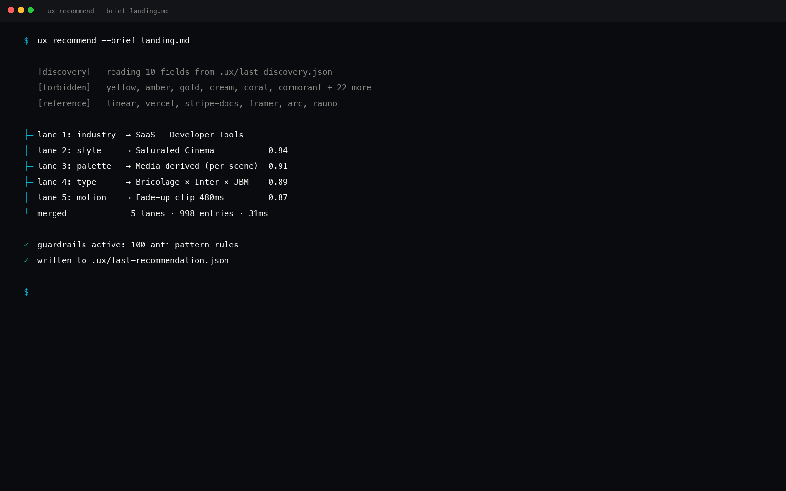
We pasted that brief into /ux-recommend. The engine ran its five parallel searches, industry, style, palette, type, motion, and returned Cormorant Garamond + Cream Editorial + warm sienna accent. Which, to the trained eye, is the claude.ai landing. The same surface every Anthropic-adjacent tool reaches for.
That was a bug in our own engine, and we filed it against ourselves. The full story is in the dogfooding war story; the short version: the editorial industry tag weighted Cormorant heavier than Fraunces, and the palette ranker preferred cream over near-black for "calm." Both fixed. Re-running the engine after the patch returned the system we actually shipped.
The palette: three colors, no gradient
Charcoal canvas, near-white ink, single amber accent. That's it. No secondary surface tint. No gradient. No glow.
Why charcoal and not pure black. #0c0a09 is warm-leaning, almost reading as a deep ink rather than a void. Pure black on a screen reads digital; warm charcoal reads cinematic. The difference is two points on each channel and an enormous gap in emotional temperature.
Why amber and not red, orange, or yellow. Amber sits at the seam between gold (heritage, paper) and yellow (alert, energy). On a charcoal canvas it reads as warm spotlight, not warning. Used once per viewport. Never used to colorize an image. Never used in a gradient.
The type: Fraunces, opsz on scroll
The display face is Fraunces, a variable serif by Phaedra Charles, Flavia Zimbardi, and Undercase Type. Two axes matter for what the homepage does: opsz (optical size, 9 to 144) and SOFT (softness, 0 to 100, controlling terminal sharpness vs round terminals).
On scroll, the hero headline animates from opsz 144, SOFT 0 (large sharp display) to opsz 36, SOFT 50 (medium, slightly softer terminals) as it shrinks into the navigation. Same letterforms, smoothly remapped. No font-swap. No double-fetch. One variable font, one fluid transform.
/* The font request */
@import url('https://fonts.googleapis.com/css2?family=Fraunces:opsz,wght,SOFT@9..144,200..900,0..100&family=Inter+Tight:wght@300;400;500;600;700&family=JetBrains+Mono:wght@400;500&display=swap');

/* The headline */
.hero h1 {
  font-family: 'Fraunces', serif;
  font-variation-settings: 'opsz' 144, 'SOFT' 0, 'wght' 500;
  font-size: clamp(56px, 9vw, 152px);
  line-height: 0.94;
  letter-spacing: -0.03em;
  transition: font-variation-settings 600ms cubic-bezier(0.16, 1, 0.3, 1);
}

/* On scroll, JS sets a class, opsz/SOFT remap */
.hero h1.compact {
  font-variation-settings: 'opsz' 36, 'SOFT' 50, 'wght' 500;
}
Body is Inter Tight (not Inter, the Tight cut has narrower side-bearings, which makes the editorial paragraphs hold density). Code and metadata are JetBrains Mono.
Why a variable font and not three font-files
Three separate Fraunces cuts (Display, Text, Caption) would be three font files. One Fraunces variable file does all three, and crucially can animate between them, which is what makes the scroll feel like a single instrument zooming, not a swap.
The motion: scroll-pinned cinema
Most landing pages stack sections vertically and fade them in on enter. The new homepage uses scroll-pinning: each major section sticks to the viewport for the duration of its scroll budget, with the inner contents transforming during that hold. The page reads like a series of cinema cuts, not a long scroll.
Two presets do the heavy lifting, both from the 57-preset motion library:
scroll-pin-hold, pins the section, runs an internal timeline scrubbed to scroll position, releases on exit.parallax-depth-3, three depth layers (background, mid, foreground) translating at 0.4x, 1x, 1.6x of scroll velocity.
Both honor prefers-reduced-motion: reduce, the pin still happens, but the inner timeline runs in a single tick rather than scrubbed, so users with motion sensitivity get the same content rhythm without the velocity.
The lint result
The page passes its own linter at --threshold high with zero findings. The full report:
$ uxskill lint docs/index.html --threshold high
// 0 findings
[OK] Scanned 1 file in 38ms · 0 findings at threshold high

$ uxskill lint docs/index.html --threshold medium
// 0 findings at medium either
[OK] Scanned 1 file in 41ms · 0 findings at threshold medium

$ uxskill lint docs/index.html --threshold low
// 1 finding at low, known false positive on intentional decorative SVG
[WARN] 1 finding at threshold low
  low  decorative-svg-no-aria   docs/index.html:284
                                Decorative SVG without aria-hidden
                                fix: add aria-hidden="true" or role="presentation"
[FIX] suppressed via /* ux-lint-disable decorative-svg-no-aria */
One low-severity finding, suppressed inline with a documented exemption (the SVG is the brand mark and is announced by the surrounding aria-label on the link, so the rule is over-firing). Every other rule is clean.
A tool that fights AI fingerprints can't ship a homepage that fingerprints as AI. We had to mean it on our own surface first.
What this is not
It's not "dark mode"
Dark mode is a runtime preference. This is the canonical canvas. There is no light-mode toggle on the homepage. The blog, the docs, and the comparison page stay on cream, the contrast between the dark editorial homepage and the cream reading surfaces is part of the language.
It's not glassmorphism
No backdrop blur, no translucent panels, no rim-light. Glassmorphism is the 2021 fingerprint we'd be replacing one cliché with another. The new homepage is flat: solid surfaces, hairline rules, no glow.
It's not Vercel-shaped
Vercel and Linear both ship dark canvases. They both use a thin neon accent (cyan, mint). The difference is the type: Vercel and Linear use neutral sans-serifs (Inter, Geist) on display. The homepage uses Fraunces, a serif, on display, animated on its opsz axis. That's where the editorial reading comes from.
How to recreate it on your project
If you want the same language without copying our homepage, the recommender ships the system as a queryable manifest. Run:
$ uxskill recommend \
    --industry "developer tool" \
    --tone "editorial,cinematic,calm" \
    --forbidden "inter-as-display,purple-to-blue-gradient" \
    --output design-system.json

[OK] System composed:
  style:        Dark Editorial (id: dark-editorial)
  palette:      Charcoal & Amber (id: charcoal-amber)
  type:         Fraunces + Inter Tight (id: fraunces-inter-tight)
  motion:       scroll-pin-hold + parallax-depth-3
  components:   12 surfaces, all dark-canvas-tuned
  brand:        none applied (no brand named in brief)
The output is a portable JSON manifest. Drop it into Cursor, Windsurf, Claude Code, or any other ux-skill-supported environment and the agent uses it as the source of truth for every subsequent generation.
Variable opsz is browser-supported but unevenly tooled.
Safari ships font-variation-settings animation cleanly. Chrome and Edge do too. Firefox honors the static settings but the animation between two states is choppier than the others, we land soft (no perceptible stutter on a 60Hz display) but it's not as silken as Safari. If Firefox parity matters more to you than the effect, drop the animation and use two static cuts instead.
The total Google Fonts request weight for the homepage is 134KB (Fraunces variable + Inter Tight five weights + JetBrains Mono two weights). On a cold cache that's noticeable on a 3G connection; on warm cache it's instant. We accept the trade.
Why the blog still uses Cormorant + Cream
Two reasons. First, we already have ten blog posts in the Cormorant + cream brand and the cost of redoing all of them outweighs the consistency gain. Second, and more importantly, the blog is a long-form reading surface. Long-form reading wants warm paper, generous leading, and a sturdy serif body face. Cormorant on cream is good at that. The homepage's job is a 200ms taste signal; the blog's job is a 12-minute hold. Different language for different jobs is correct.
The next blog re-skin (probably v2.2) will likely move to Fraunces + cream, keeping the dark canvas exclusive to the marketing surface. Tracked in the roadmap.
Related reading
- Dogfooding ux-skill, the bugs we found by using our own engine, full story of the Cormorant+Cream → Charcoal+Fraunces pivot.
- 57 motion presets for AI coding, including
scroll-pin-holdandparallax-depth-3. - Python design system generator, how the recommender composes a system like this one.
- Regex linter for AI coding, 51 rules in CI.
- About, the project and the maker.
- Compare, against ui-ux-pro-max, taste-skill, and Figma MCP.