FIELD NOTES · 2026-05-29
Why AI design always reaches for the same typeface.
Ask a model to design anything and the body text comes back in Inter, with the system font stack as backup. It is a fine instinct: Inter is one of the best screen typefaces ever drawn. But it shows up on the luxury landing page, the children's app, the editorial magazine, and the bank dashboard, all identical, and that is the tell. Not that the type is bad. That no type decision was made.
The default has a cause, not a taste
A model does not pick a typeface the way a designer does. It predicts the most probable next token, and for "the font of a modern web app" the most probable answer is overwhelmingly one name. Three forces stack the deck.
The reference UIs all use it. Tailwind UI ships its examples in it. Vercel's own properties set their interface in it. shadcn's starter, copied into thousands of repositories, inherits it by default. The screenshots a model learned "good app design" from are, disproportionately, set in this one face.
The component-demo corpus reinforces it. The dribbble shots and template marketplaces that read as "clean and modern" lean on the same neutral grotesque, because it photographs as competent in a thumbnail. The model absorbed the correlation: this shape equals polished.
The fallback is the safest string in CSS. When nothing is specified, the path of least resistance is the native system stack, the one beginning with -apple-system that every boilerplate carries. So even the "no font chosen" case resolves to a known, beige default.
Inter is safe precisely because it is everywhere. A model minimizing risk regresses to the most common choice in its training data, and for interface type, that choice is Inter.
When Inter is exactly right
None of this is an argument against the typeface. Inter was drawn for screens, at small sizes, with a tall x-height, open apertures, and tabular figures that line up in a column. For a dense, utilitarian interface (a trading terminal, an admin panel, a settings screen full of numbers) it is close to the correct answer, and reaching for it there is good engineering, not laziness.
The failure is not the face. It is using one face for every voice. A typeface carries tone the way a speaking voice does, and a single neutral grotesque has exactly one register: efficient. Apply it to a surface whose job is warmth, authority, play, or craft, and the type contradicts the brief in silence.
The tell is the absence of a decision
Here is the same project across surfaces. The column that matters is the last one: what a considered pairing would do instead.
| surface | Inter the right call? | a pairing with intent |
|---|---|---|
| Analytics dashboard | Yes: dense, numeric, scanned often | Inter body with tabular figures, a mono for codes |
| Editorial / long read | No: needs reading rhythm | A serif text face for body, a grotesque for labels |
| Luxury / fashion brand | No: needs restraint and air | A high-contrast didone display over a quiet humanist body |
| Playful consumer app | Rarely: too neutral to have a voice | A rounded sans paired with a friendly geometric |
| Developer tool | Often: utilitarian fits | A grotesque display with a strong mono for code |
Notice that Inter survives in two of five rows, and even there it earns its place by doing a specific job rather than by being the default. The point is not to ban it. The point is to choose it on purpose, the same way you would choose any of the others.
What a real type decision looks like
Three moves separate a chosen system from a defaulted one. First, a pair, not a single face: a display for headings with character, a body for reading comfort, and usually a mono for code and figures. Second, pairing contrast: the two faces should differ enough to create hierarchy on their own, so a humanist body wants a more structured or higher-contrast display rather than a near-twin. Third, a real reference: not "modern and clean" but "set type the way this specific brand does," because brands solved this problem with constraints the average never had.
How ux-skill picks type with intent
This is encoded in the engine, not left to a reminder in a prompt.
The type-pair manifest carries more than 65 curated pairings, each a display, body, and mono chosen to work together and tagged by the voice it serves: editorial, brutalist, luxury, technical, playful. When the engine recommends type, it draws from that library, so the starting point is a pairing made on purpose rather than the single most common face.
The typography axis turns the brief into the choice. A high-density, technical surface resolves toward a tight grotesque and a strong mono; a formal, low-density brand resolves toward contrast and air; an editorial surface resolves toward a text serif with a grotesque for furniture. Same request next week, same machine or another, returns the same pairing: deterministic, offline, no model in the loop.
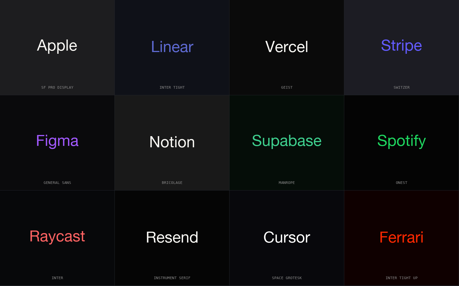
And the brand specs encode how real companies actually set type, so the reference is a specific system rather than the mean of all of them. Stripe runs a custom grotesque tuned for its product and reserves weight for hierarchy. Linear sets a near-monochrome interface in a tight neutral sans and lets spacing do the talking. Ferrari pairs an assertive display with restraint everywhere else. Anthropic builds on a warm, readable text face rather than the standard interface grotesque. None of them ships the same font as everyone else, because type is where a brand's voice is most audible.
The linter closes the loop. One rule flags a single neutral sans used as the only typeface on a surface whose voice asks for more, and the companion rule catches the bare system-font stack standing in for a real choice. So the face a model defaults to is the face the engine asks you to justify before it ships.
The escape, in one line
Pick a pair, not a face. Let the surface's voice (editorial, luxury, technical, playful) choose the display, and let the body face serve reading. Keep Inter for the dense, numeric screens it was actually drawn for, and reference how a real brand sets type instead of the average of all of them. Do that and the default has nothing left to pull you back toward.
pip install uxskill
# then, in your AI coding tool:
# /ux-recommend  : pulls a type pair from 65+ curated pairings, matched to your voice