FIELD NOTES · 2026-05-29
Why AI reaches for the purple gradient, every single time.
You can spot an unsupervised model's design work from across the room: a violet-to-blue gradient on a near-white page, a saturated indigo primary, a panel of frosted glass floating over a soft glow. It is so consistent it has become a tell. The gradient is not a style choice. It is the average of everything the model has seen, and average is exactly what makes it slop.
The signature is real, and it has a cause
Three forces stack up, and they all point the same direction.
The training set is a frozen moment in SaaS history. A huge share of the landing pages a model ingested were built during one specific era (roughly 2020 to 2023) when the violet-to-blue hero gradient was the house style of every Series-A startup. The model did not invent the look. It memorized a fashion and kept wearing it after everyone else moved on.
The framework defaults push the same hue. Tailwind's own documentation accent is indigo; its example components lean violet. When a model is asked for "a primary button" with no palette specified, the path of least resistance is the color the docs themselves use. The default becomes the answer, and the answer becomes a habit.
The popular-template aesthetic reinforces it. Dribbble shots and best-selling marketplace themes over-index on glossy purple-and-blue because it photographs well in a thumbnail. The model learned that this look correlates with "polished," so when it plays it safe, it reaches for it.
The gradient is safe precisely because it is average. A model minimizing risk regresses to the centroid of its training data, and for web design, that centroid is violet.
Why "average" reads as fake
Human designers anchor on a brand: a specific company, a feeling, a real constraint. The model has none, so it anchors on the mean of all brands at once, and the result belongs to no one. It is competent, symmetrical, and instantly forgettable: a harsher fate than ugly. Ugly gets remembered. Average gets scrolled past.
The gradient rarely travels alone. It arrives with an entourage of co-occurring tells from the same centroid: glassmorphism with no real depth behind it, a glow under every card, pure black text on pure white, and customer logos still in their original brand colors. Spot one and you can predict the rest.
The slop palette versus a considered one
The fix is not "avoid purple." Purple is fine. The fix is to stop letting saturation and decoration do a job that value and meaning should do. Here is the swap, role by role.
| role | slop default | better choice |
|---|---|---|
| Primary accent | Saturated violet, over 80% saturation | One accent under 80% saturation; contrast from value, not chroma |
| Hero background | Full-bleed purple-to-blue gradient | A flat neutral; let type and space carry the page |
| Headline | Rainbow gradient clipped to the text | Solid ink, weight and size for hierarchy |
| Card depth | Colored glow plus frosted glass | A single hairline border or one quiet shadow |
| Neutrals | Pure black on pure white | Off-black and warm off-white; never the absolutes |
| Status color | The accent reused for everything | Reserved semantics: success, warning, danger only |
Notice the through-line. Color stops decorating and starts meaning something. The one accent identifies the brand; the semantic set carries state; the neutrals do the heavy lifting. Nothing on the surface is colored just to look designed.
How ux-skill steers off the centroid
This is not a matter of taste reminders. The discipline is encoded in the engine.
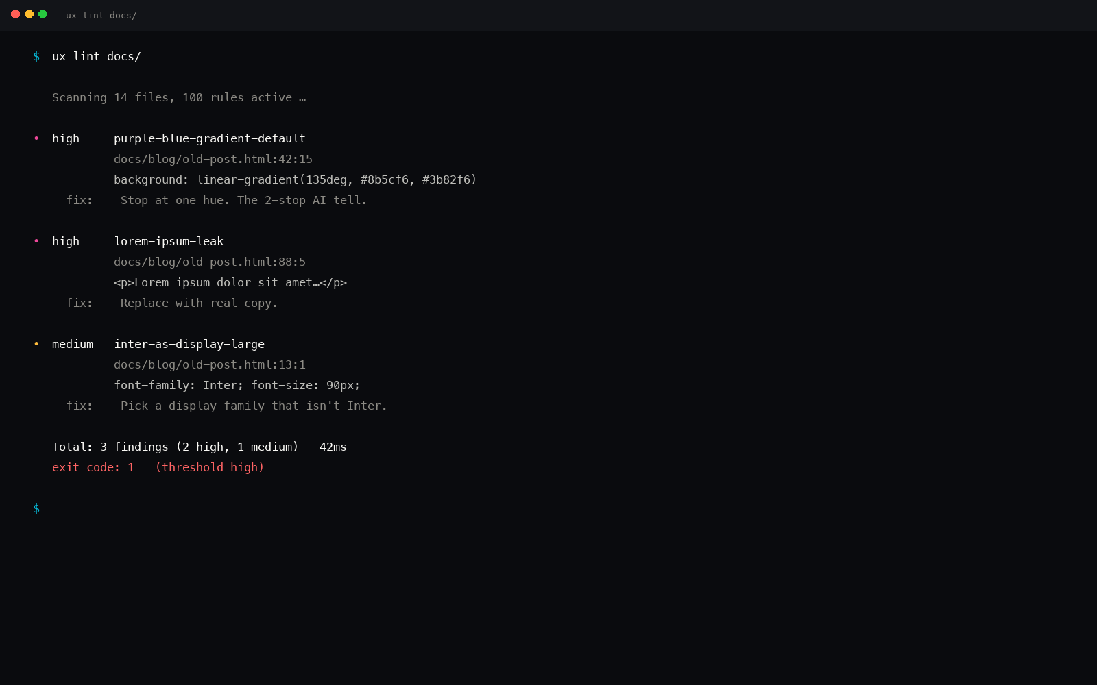
The anti-slop linter ships explicit rules for exactly this fingerprint. One rule matches the purple-to-blue gradient in both its Tailwind-class form and its raw-hex form and flags it as a high-severity tell. Another flags any accent over 80% saturation in a restrained style. A third catches multi-stop chrome gradients, and another catches the colored card glow. The look that a model defaults to is the look the linter is built to reject. Run uxskill lint and the regression gets caught before it ships.
The palette manifest carries more than 170 real, hand-checked palettes: pulled from actual products, not generated toward the mean. When the engine recommends color, it draws from that library, so the reference point is a specific considered system rather than the centroid of all of them.
And the brand specs (161 of them) encode how real companies actually use color. Stripe leans on a confident indigo but spends most of its surface on near-white and ink. Linear runs almost monochrome and lets one cool accent do the work. Ferrari hoards its red for the moments that earn it. Anthropic builds on warm neutrals with one restrained accent. None of them paints the whole page in a gradient, because color spent everywhere is color that means nothing.
The escape, in one line
Pick one accent and keep it under 80% saturation. Let semantic color carry meaning, not decoration. Make your neutrals slightly warm or cool instead of pure gray. And reference a real brand's palette instead of the average of all of them. Do those four things and the violet centroid has nothing to pull you back toward.
If you are evaluating a site you did not build, the purple gradient is one of nine tells that surface without opening the code. The full visual checklist is at how to tell if a website was AI generated.
pip install uxskill
# then, in your AI coding tool:
# /ux-recommend  : pulls from 170+ real palettes, never the violet mean
# uxskill lint    : flags the purple-to-blue gradient before it ships