FIELD NOTES · 2026-05-29
Why every AI UI reaches for the bento grid.
In about two years the bento grid went from an Apple keynote device to the reflex an AI builder reaches for the moment you say "feature section." You know the look: a mosaic of rounded tiles in mismatched sizes, one big, two medium, three small, arranged like a lunchbox. It can be the right call. Most of the time it is not. It is six equal ideas crammed into unequal boxes, variety with no reason behind it.
Where the reflex comes from
Apple popularized the modern bento layout, and the design web copied it hard. Tailwind's marketing examples lean on it; component galleries are full of it; landing-page templates ship it as the default "features" block. So the screenshots a model learns from are saturated with bento. When you ask for a feature section, the most-represented answer in the training data is a mosaic of tiles, and that is what comes back.
There is a second pull, and it is the more honest one. A bento grid looks designed. Uneven tiles read as deliberate composition; a plain list reads as something you did not finish. Faced with a blank section, reaching for the mosaic is the safe move that signals effort. The model has the same incentive a junior designer does: produce something that looks considered, fast.
The bento grid is what AI reaches for when it wants to look like it made a layout decision without actually having to make one.
Bento is a content-fit decision, not a default
The grid was never the point. The point is weight. A real bento works because the tiles carry genuinely different things at genuinely different sizes: a headline metric in the big cell, a small chart beside it, a one-line quote, a product image, a short stat. The sizes map to importance, and the mix of content types is what makes the asymmetry read as composition instead of clutter.
Most generated bento has none of that. It is six feature blurbs (same icon-title-sentence shape, same informational weight) poured into a big-medium-small template. The tiles differ in size; the content does not. The eye expects the large cell to matter more, finds another tagline, and the whole thing quietly registers as decoration. That is the tell: visual variety with no informational reason for it.
When it works, and when it is just decoration
| signal | bento is right | bento is decoration |
|---|---|---|
| tile content | a stat, a chart, a quote, an image | six near-identical blurbs |
| weight | one idea clearly dominates | all items are peers |
| cell size | maps to importance | random big / medium / small |
| if you delete a tile | the grid rebalances meaningfully | nothing changes but the count |
| better as a list? | no, the mix needs a plane | yes, a rhythm would read cleaner |
The deletion test is the fast one. If you can pull any tile out and the section reads the same, the sizes were never carrying meaning, and a simple rhythm (equal cards, or a clean list with strong type) will beat the fake mosaic every time.
Let hierarchy choose the layout
The fix is not "stop using bento." It is to choose the layout from the content, not from the trend. Lay out what you actually have and read the weights first:
- Items are genuine peers, same shape, same weight → a rhythm or a list. Equal cells, consistent spacing, one strong type scale. Honest and scannable.
- One item clearly dominates and the rest support it → a hero plus a secondary row. Two weights, not five.
- Three or more genuinely different content types at different importances → that is the case bento was built for. Use it.
Reserve the mosaic for real weight differences, and it stops being a tic and goes back to being a tool. The work is the read, not the grid.
How ux-skill handles it
This is exactly the kind of trend-default the engine is built to resist. The components manifest carries bento alongside its alternatives (rhythm grids, hero-plus-secondary, list-with-emphasis) so a feature section has more than one answer to reach for. The landing-pattern manifest does the same at the section level, pairing each pattern with when it fits and when it does not.
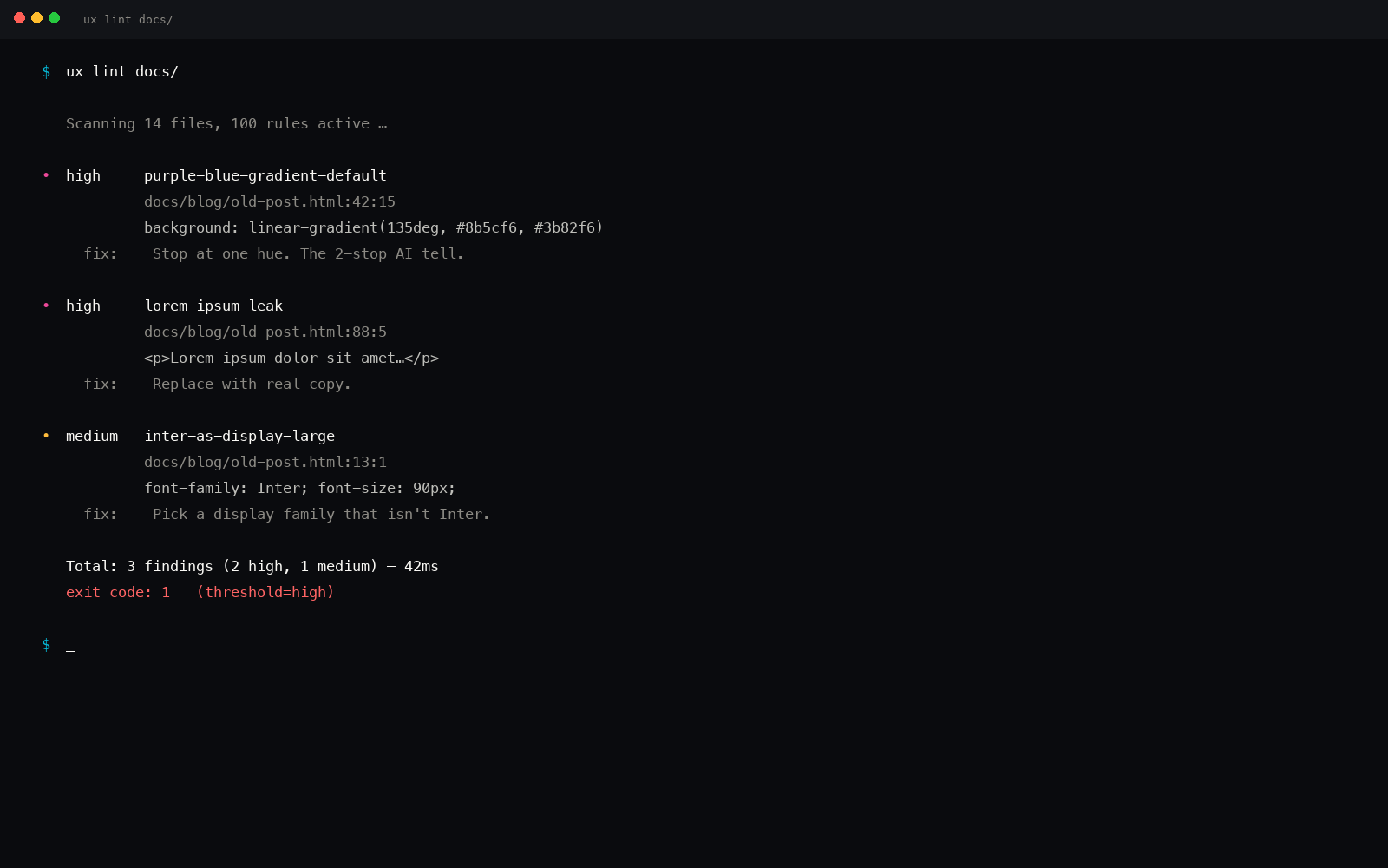
The layout synthesizer then maps content weights to cell sizes. Feed it items with real differences and it returns a bento with the big cell on the thing that matters; feed it peers and it returns a rhythm, because there is nothing for the asymmetry to express. And the linter closes the loop: it flags variance with no informational backing (uneven tiles holding even content) as decoration-only, the same way it flags a chrome gradient or a shadow standing in for depth.
Same brief, run again next week, on another machine: the same call. Deterministic, offline, no model guessing in the loop.
The point
Every AI UI reaches for the bento grid because the training data is full of it and a mosaic is the cheapest way to look like a layout happened. But bento is a content-fit decision, not a default. Read the weights. If the items are peers, give them a rhythm. If one dominates, give it the room. Save the lunchbox for the meal that actually has different dishes on it.
pip install uxskill
# then, in your AI coding tool:
# /ux-design     : layout chosen from content weights, not the trend
# /ux-recommend  : bento plus alternatives, with the linter watching for decoration