FIELD NOTES · 2026-05-29
Why AI dashboards all look the same,
and the density fix.
Ask any AI builder for a dashboard and you get the same screen: a left sidebar, a top bar, four stat cards in a row, one line chart, and a table, all in shadcn defaults with a violet accent and the same generous spacing. The layout isn't the real problem. The density is. AI ships landing-page spacing onto data-dense surfaces, and that single mistake is why every generated dashboard feels like a toy.
The dashboard centroid
Landing pages converge on a recognizable look; dashboards have their own centroid, and it is even tighter:
- Left sidebar with icon + label nav, a top bar with a search and an avatar.
- A row of four stat cards: big number, tiny label, a +/- delta in green or red.
- Exactly one line chart, usually spanning the full width, regardless of whether the data is a trend.
- A table below it with default row height and zebra striping.
- The same airy padding everywhere, a violet primary, and a soft shadow on every card.
It is competent. It is also instantly forgettable, and it wastes most of the screen.
The real failure is density, not layout
A landing page should breathe: it has one job and a lot of room to do it. A dashboard is the opposite: its job is to put a lot of legible information in front of someone who scans it fifty times a day. That is a density problem, and it is the one thing the generated default gets wrong every time.
Think of a spectrum from art gallery (one object, vast negative space) to cockpit (every inch carries a reading). Marketing sites live near the gallery end. Dashboards live near the cockpit end. The model, trained mostly on marketing and component-demo screenshots, applies gallery spacing to a cockpit surface: 16-24px gaps where 4-8px would serve, oversized cards, one chart where six small multiples belong.
The generated dashboard isn't ugly. It's under-dense: it shows a tenth of what the space could hold, so it reads as a prototype, not a tool.
The density axis
ux-skill treats density as a first-class, continuous axis, one of the seven a brief compiles to. For a dashboard you push it high, and the synthesizer changes concrete tokens:
| density | formality | spacing base | feel |
|---|---|---|---|
| > 0.65 | any | 4px | Bloomberg / cockpit |
| < 0.4 | > 0.7 | 12px | luxury / airy |
| else | any | 6-8px | standard app |
A 4px base does not just shrink gaps; it cascades: tighter line-height, a compressed type scale, smaller control targets, and row heights tuned for scanning. The result holds three to five times the information of the generated default in the same viewport, without feeling cramped, because the rhythm is intentional rather than residual.
The VISUAL_DENSITY dial makes this explicit: 1 is an art gallery, 10 is a cockpit. Landing pages default low; dashboards default to 8. Set it once and every token downstream follows.
Stop defaulting to the line chart
The other dashboard tell is chart monoculture: one line chart for everything. A trend over time is a line. A part-to-whole is not: it is a stacked bar or a treemap. A distribution is a histogram. A correlation is a scatter. ux-skill's catalogue carries 35 chart types keyed to data shape, so the recommendation matches what the metric actually is instead of reaching for the default. Picking the right encoding does more for legibility than any amount of styling.
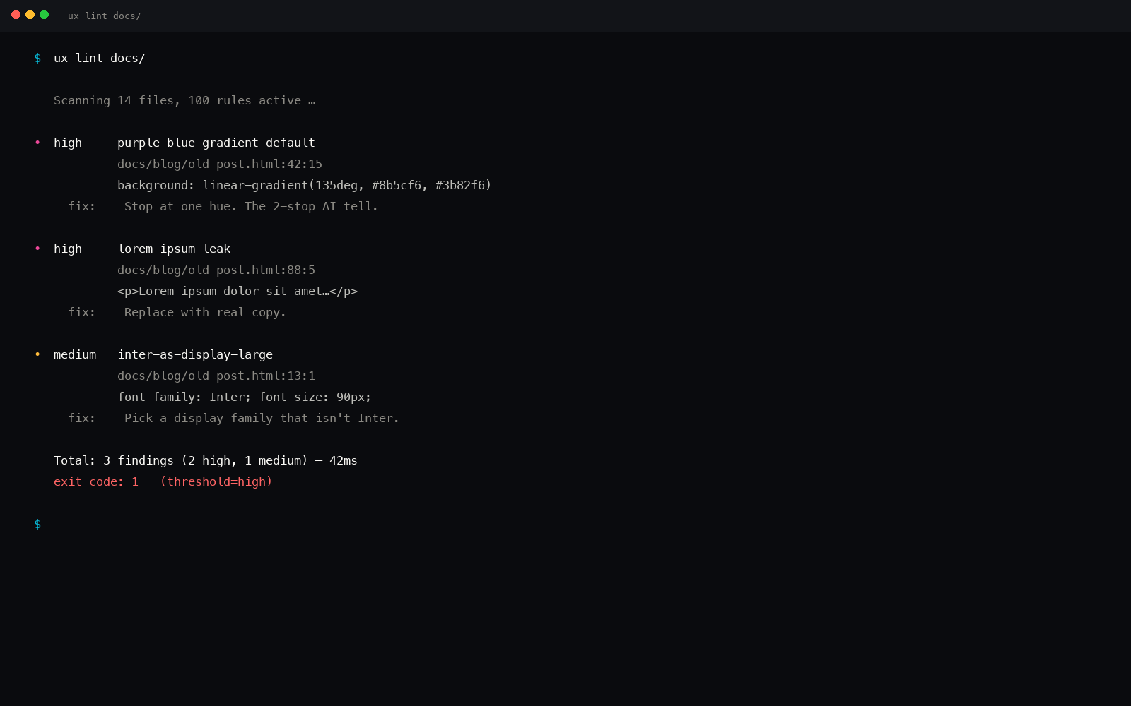
While you are at it: kill the gradient fills under the line, drop the drop-shadows on data cards, and let a single semantic accent carry state (up, down, warning). Decoration on data is noise: the anti-pattern linter flags chrome-y gradients and shadow-only depth for exactly this reason.
A dashboard brief, compiled
You ask for: surface=dashboard, industry=analytics, tone=["serious", "dense"].
- Density resolves high (the "dense" tone plus an analytics industry seed) → 4px spacing base.
- Type scale compresses to a 1.2 ratio → headings sit close to body, no marketing-size jumps.
- Palette goes near-monochrome with one semantic accent set (success / warning / danger) reserved for data state, not decoration.
- Radius drops to 2-4px: sharp, instrument-like, not the soft
rounded-2xlcard. - Charts are recommended per metric from the 35-type catalogue, not defaulted to a line.
Same request, run again next week, on a different machine: identical output. Deterministic, offline, no LLM in the engine.
The point
Generated dashboards look the same because the model applies marketing spacing to an instrument. Fix the density (make it an explicit axis the brief controls) and the rest (charts, color, radius) falls in line. A dashboard should read like a cockpit you trust, not a landing page with a table glued on.
pip install uxskill
# then, in your AI coding tool:
# /ux-dashboard  : density-aware, chart-matched, deterministic