FIELD NOTES · 2026-05-29
Every AI landing-page hero is the same hero.
Ask any AI for a landing page and the top of the screen is already decided: a centered headline, a centered one-line subhead, a filled primary button sitting next to a ghost secondary, a soft gradient or faint grid behind it, and a product screenshot tucked into a tilted browser frame just below. It is competent, it is safe, and it is the same hero you have seen a thousand times, because it is the average of a thousand heroes the model trained on.
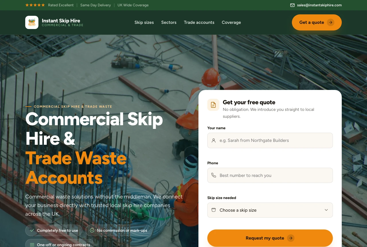
The hero centroid
Landing pages converge on a recognizable shape, and the hero converges hardest of all. Ask five different AI tools and you get five copies of one arrangement:
- A centered H1, two or three lines, often with one word in a gradient or a brighter weight.
- A centered subhead directly under it: one sentence, muted, explaining what the H1 just said.
- Two buttons side by side: a filled primary and a ghost or outline secondary, both the same size.
- A backdrop that fades from one tint to another, or a faint dot-grid, doing nothing but filling space.
- A product screenshot in a tilted, perspective browser frame, floating below the buttons.
None of it is wrong. All of it is forgettable. The hero is the one place a brand can land a punch, and the generated default spends it on an arrangement that says nothing about the product.
Why the model ships it every time
This is the centroid problem in its purest form. The hero is the most-screenshotted section of the most-screenshotted page on the web, so the training data for "landing page" is saturated with this exact composition. When a model predicts the most probable hero, it returns the densest point in that cloud: dead center, two buttons, a gradient, a screenshot. The average of every SaaS hero is a centered SaaS hero.
The dual button is the same instinct applied to intent. The model has seen "primary plus secondary" so many times that it treats two CTAs as the default, even when the page has exactly one thing it wants you to do. The tilted screenshot is a learned flourish: it reads as "modern SaaS" because it was modern SaaS, in 2021, on the pages everyone copied.
The generated hero is not ugly. It is the visual equivalent of clearing your throat: technically a sound, but not yet anything worth hearing.
The four moves that break the template
Breaking out of the centroid is structural, not cosmetic. You do not fix a generic hero by swapping the gradient; you fix it by changing the arrangement, the intent, and what carries the brand. Four moves do most of the work:
| slop hero element | why it ships | stronger choice |
|---|---|---|
| Centered H1 + subhead | Densest point in training data | Asymmetric split: copy left, proof right |
| Filled + ghost button pair | "Primary + secondary" learned as default | One confident CTA; demote the second to a text link |
| Soft gradient / dot-grid backdrop | Fills space without a decision | Type and a real image carry the brand |
| Screenshot in a tilted frame | Copied "modern SaaS" flourish | A genuine wow moment: live demo, motion, or a bold crop |
Asymmetry is the biggest single lever. A centered hero treats both halves of the viewport as equal; an editorial or split hero gives the headline a side and the proof a side, and the page reads as designed rather than defaulted. The CTA is second: two equal-weight buttons split attention, where one confident button directs it. The backdrop and the frame are third and fourth: stop asking decoration to do the brand's job, and put that weight on type, a real image, and one moment a visitor remembers.
How the engine forces it
ux-skill treats the hero as a layout decision the brief drives, not a template it reaches for. Three parts of the engine push against the centroid directly:
- The layout synthesizer reads a variance signal from the brief, and above a threshold it forces an asymmetric hero. The centered arrangement is taken off the table when the brand wants to stand out, not blended in.
- The anti-slop linter flags the centered-hero composition and the filled-plus-ghost dual-button default as patterns, so they surface in review instead of shipping silently. It is the same pass that catches gradient text and decorative shadows.
- The landing-pattern manifest carries real alternatives keyed to brand and industry (
split,editorial,terminal,bento), so the recommendation is "here is a hero that fits you," not "here is the hero everyone gets."
Run the same brief next week, on a different machine, and the engine returns the same hero: deterministic, offline, no model in the loop. The variance is derived from the brand, not sampled at random.
A hero brief, compiled
You ask for a landing page with a brief that scores high on distinctiveness: a developer tool with a sharp, technical voice. The engine does not center it:
- Variance reads high, so the synthesizer drops the centered default and resolves to a
splithero: copy and CTA on one side, a live terminal on the other. - The dual-button default collapses to one primary action; the secondary path becomes a quiet inline link, so attention has a single target.
- The gradient backdrop is dropped: the type scale and a real product surface carry the weight, with one semantic accent reserved for the CTA.
- The tilted screenshot frame is replaced by the actual interface, shown straight, because a real artifact beats a flattering angle on a fake one.
The result still reads as a hero. It just reads as this product's hero, which is the entire point.
The point
AI ships the same hero because the hero is the densest point in its training data, and predicting the most probable composition lands you dead center every time. Break it where it actually breaks: asymmetry over symmetry, one confident CTA over two timid ones, type and a real image over a backdrop that decides nothing, and one genuine moment over a stock arrangement. The first screen is the one place a brand gets to make a first impression. Do not spend it on the average.
pip install uxskill
# then, in your AI coding tool:
# /ux-design     : asymmetry forced above the variance threshold
# /ux-recommend  : a hero pattern keyed to your brand, not the centroid