FIELD NOTES · 2026-05-29
Why v0, Bolt, and Lovable all ship the same look.
Prompt-to-app builders are genuinely fast. Describe an app and v0, Bolt, or Lovable hands you a running screen in seconds. Then you notice every screen rhymes: a centered hero over a soft gradient, three equal feature cards, a violet primary, Inter, the same airy spacing on a marketing page and a settings panel. The speed is real. So is the sameness, and re-prompting your way out of it rarely works.
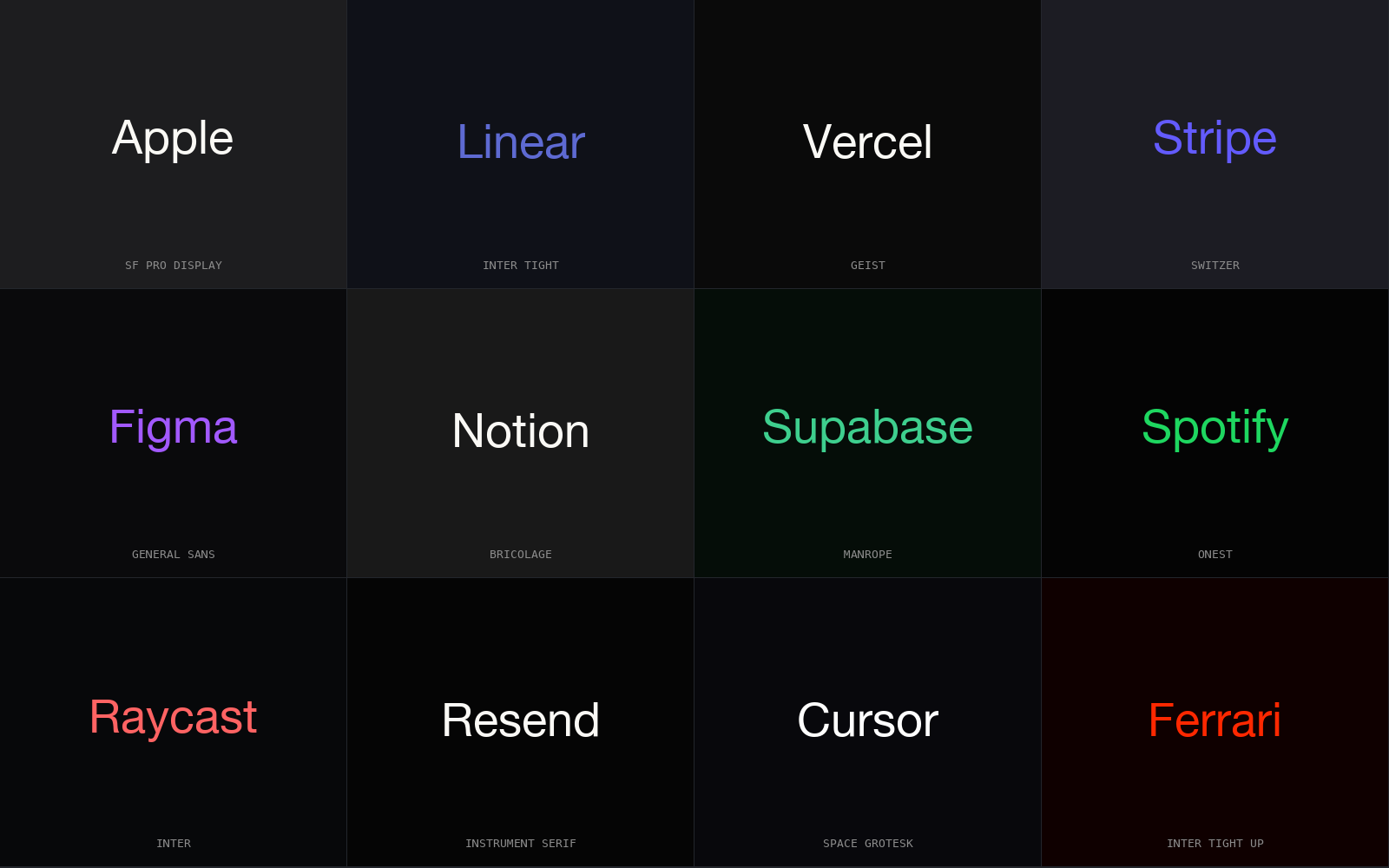
The same screen, every time
The convergence is specific enough to list. A fresh generation tends to land on the same vocabulary:
- A centered hero with a headline, a one-line subhead, and a soft gradient washing the background.
- Three equal cards in a row for features, each with a small icon, a short title, and two lines of body.
- A violet or indigo primary, the same one you have seen on a hundred other generated apps.
- Inter for everything, set at the same large display sizes the demos use.
- Generous, uniform spacing: the same padding on a hero and on a dense table, because nothing told the model they differ.
It looks plausible, which is exactly the trap. Plausible is the target the builder is optimizing for, and plausible has a single most-likely shape.
Why plausible means identical
A prompt-to-app builder is graded, implicitly, on two things: the code runs, and the result looks like a real app. Both pressures point at the center of the training distribution. The most defensible output for an underspecified request is the most common one: the average of every hero, card row, and palette the model has seen. That average is the centroid, and regression to it is what optimizing for "looks right" does when the brief is a sentence. Tailwind and shadcn defaults sharpen it further: a known set of utilities and a known palette is the path of least resistance, so the convergence is baked into the materials too.
An empty brief has a most-likely answer, and every builder returns it. Sameness is not a failure of imagination. It is the correct response to a request that carries no constraints.
Why "make it more unique" does not work
The reflex is to argue with the output: make it more beautiful, more premium, more unique, less generic. This mostly fails, and for a concrete reason. An adjective is not a constraint the model can satisfy deterministically. It is a vibe with its own centroid. "More unique" resolves to a slightly different draw from the same distribution: swap the violet for a teal, bump a radius, add a blur behind the hero. The vocabulary is unchanged because nothing pinned it down. You are re-rolling the dice, not loading them.
| you say | what the model does | result |
|---|---|---|
| "make it more beautiful" | redraws from the same distribution | same hero, softer shadow |
| "make it more unique" | swaps one token for a neighbor | teal instead of violet, still centered |
| "make it premium" | adds decoration, not structure | more gradient, more blur |
| "use a 4px spacing base, mono display, sharp radius" | obeys named tokens | a different system, repeatably |
The fix is not a better adjective. It is structure: concrete tokens the generated code has to use, supplied before the first generation instead of negotiated after it.
Feed it tokens, not adjectives
A brief beats a vibe when it resolves to specifics: a named palette, a type pair, a density target, a radius, motion presets, and component choices. Those are values the model can apply without guessing. ux-skill produces exactly that brief: you run a short discovery intake and the engine returns a complete system drawn from its data manifests, which you paste into v0, Bolt, or Lovable as the constraint. The builder fills it in instead of inventing it.
The engine is deterministic and offline, with no model inside it: the same brief maps to the same system every time, on any machine, because the recommendation is a lookup over fixed data, not a generation. That is the property the builders lack: a stable source of constraints they can be made to obey.
Density is the token that most exposes the gap. Builder output defaults to landing-page spacing everywhere, because marketing screens dominate the training data and nothing in the prompt says a settings table is not a hero, so app surfaces feel under-dense, holding a fraction of what the viewport could carry. ux-skill treats density as a first-class dial: set it high and the spacing base tightens, the type scale compresses, and radii sharpen together, so the result reads like a tool rather than a brochure with inputs glued on.
The linter catches the centroid tells
The give-aways are mechanical, so they can be checked mechanically. ux-skill ships a regex linter that flags the exact signatures of a centroid render: a violet-to-blue gradient, a row of three equal feature cards, a default named palette used for primary, marketing filler in headings, the same generic call-to-action text. Run it over what a builder generated and the tells surface as findings with line numbers and fixes, scored to a number you can gate on. Generate with a structured brief, lint the result, fix what it flags, and the output stops looking like every other generated app, because it was never asked to be average.
The point
v0, Bolt, and Lovable converge because an empty brief has one most-likely answer, and adjectives cannot pull them off it. Supply structure instead (a deterministic system of real tokens the generated code must use, plus a linter to catch the drift) and the same fast builders produce something that is actually yours.
pip install uxskill
# then, in your AI coding tool:
# /ux-recommend  : a complete system from a brief, deterministic and offline