FIELD NOTES · 2026-05-29
Why AI design has the same surface texture every time.
Look at a screen an unsupervised model produced and you can feel it before you can name it: every card has a big corner radius, a soft diffuse shadow underneath, a 1px translucent border, and now and then a faint gradient along the edge. It is a texture, and it is the same texture every time. The surface is not wrong, exactly. It is generic: soft and weightless, the look of a thing that was averaged rather than designed.
The texture is a fingerprint
Three traits show up together so reliably that spotting one lets you predict the rest:
- A large corner radius on everything: buttons, inputs, cards, modals, the whole surface rounded to the same generous curve.
- A soft, diffuse drop shadow under every card, low opacity and a wide blur, applied whether or not the element is meant to float.
- A 1px translucent border, often paired with a faint gradient stroke, sitting on top of the shadow as a second depth cue doing the same job.
None of these is a crime on its own. Stacked on every element at once, they read as a single material: pillowy, frosted, and indistinguishable from the last ten interfaces a model generated. The texture is the tell, the way the violet gradient is a tell.
Where the texture comes from
It is the same mechanism behind every slop signature: the model regresses to the centroid of its training data, and for component surfaces that centroid is sharply defined.
The framework defaults set the curve. shadcn/ui and the Tailwind ecosystem ship a card with a rounded corner and a soft shadow as the out-of-the-box look. When a model is asked for "a card" with no spec, the path of least resistance is the default the docs themselves render. The default becomes the answer, and the answer becomes a habit.
The popular-shot aesthetic reinforces it. The glassmorphism wave on Dribbble (frosted panels, soft glows, gentle rounding) photographs beautifully in a thumbnail. The model learned that this surface correlates with "polished," so when it plays it safe, it reaches for the soft, rounded, shadowed card.
The soft card is safe precisely because it is average. Nothing about it is a decision: radius, elevation, and border were all inherited from the default, so the surface belongs to no brand and no density.
Why soft and weightless reads as generic
Radius and elevation are not cosmetic. They carry meaning, and the default throws that meaning away.
Corner radius sits on a spectrum. A sharp radius reads precise, editorial, instrument-like: the surface of a tool you trust with real work. A large radius reads friendly, approachable, consumer: the surface of an app you hand to anyone. The default picks the friendly end for everything, so a fintech ledger and a kids' game wear the same soft corners, and neither says anything specific.
Elevation is worse. A drop shadow is supposed to mean one thing: this layer is above that layer. A menu floats over the page; a dialog floats over the menu. When every card carries the same shadow, depth stops being information and becomes decoration: the surface looks busy and floaty while telling you nothing about what is actually on top.
Radius and elevation as decisions
The fix is to treat both as tokens tied to brand and density, not as inherited defaults. ux-skill encodes them in the style and components manifests, where each style carries its own radius scale and shadow set rather than one global softness.
| style | radius | elevation intent |
|---|---|---|
| Editorial / instrument | 2-4px | Hairline borders, no shadow; depth from layout, not glow |
| Standard app | 8-12px | One quiet shadow reserved for true overlays (menu, dialog) |
| Consumer / friendly | 16-20px | Soft shadow on cards that genuinely lift; flat surfaces stay flat |
The density axis drives the radius directly. Push density high for a data-dense surface and the synthesizer pulls the radius down toward the sharp, instrument end: soft 20px corners waste pixels and blur the grid a cockpit needs. Pull density low for an airy marketing page and the radius can open up, because the surface has room to feel friendly. Radius is not a constant you pick once; it falls out of how dense the surface is meant to be.
Elevation gets the same treatment: shadows map to real z-layering. A token exists for the overlay tier and is spent only there. A flat card stays flat. A border and a shadow never stack to do the same job twice, because that is two depth cues for one layer: the redundancy that makes the default surface feel padded.
What the linter flags
The discipline is encoded, not left to a taste reminder. The anti-slop linter ships rules aimed at exactly this texture.
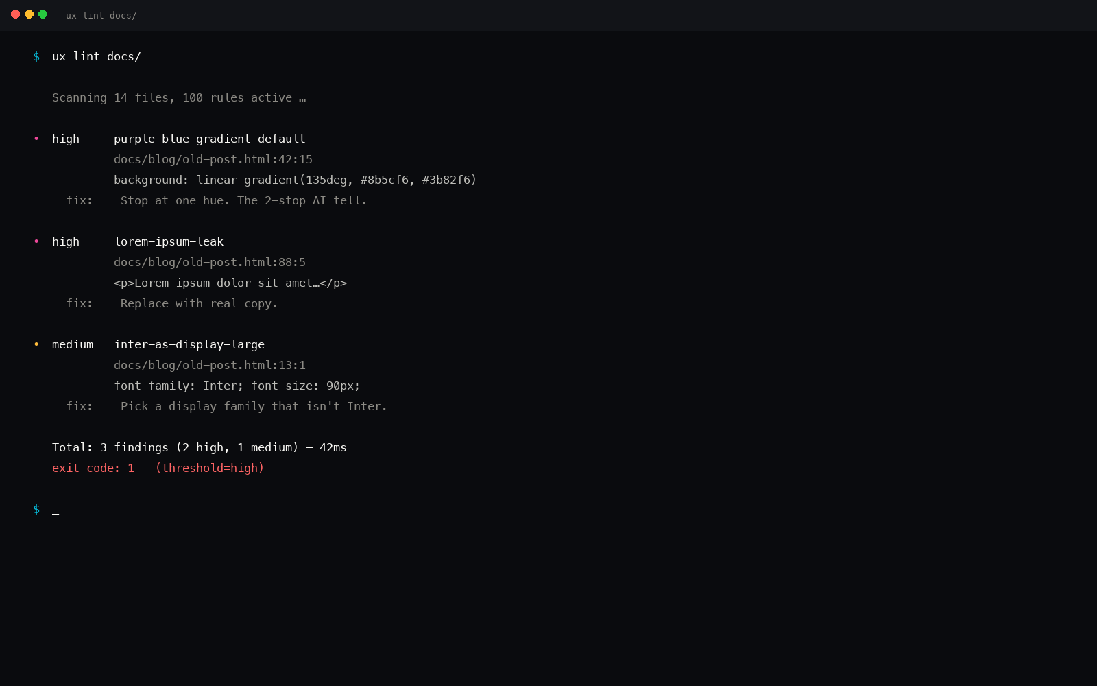
One rule matches the big-radius default in its utility-class form and its raw-value form, and flags it as the generic-card tell: radius applied as a default instead of chosen. Another catches shadow-only depth: a multi-layer stacked drop shadow doing decorative work, the soft glow under every card. A third catches the colored card glow, and the glassmorphism rule fires when frosted blur is layered across the whole surface with no real depth behind it. Run uxskill lint and the inherited texture gets caught before it ships, the same way the purple gradient does.
A card brief, compiled
You ask for: surface=card, industry=fintech, tone=["serious", "precise"].
- Density resolves high (the "precise" tone plus a fintech seed) → the radius scale drops to a sharp
4px, not the inherited soft corner. - Elevation resolves to borders: a single hairline separates the card from the canvas, and the shadow token is held back for overlays only.
- The faint gradient stroke is dropped: one border does the separation, so a second decorative edge is redundant.
- A consumer brief, run instead, opens the radius to
16pxand allows one soft shadow on cards that actually lift, while flat regions stay flat.
Same request, run again next week, on a different machine: identical output. Deterministic, offline, no LLM in the engine.
The point
AI surfaces share a texture because radius and elevation were inherited from the framework default instead of chosen. Set them with intent (radius tied to brand and density, elevation mapped to real z-layering) and the surface stops reading as the average of every card a model has seen. Sharp can mean precise. Large can mean friendly. A shadow can mean above. The default means none of those, which is why it means generic.
pip install uxskill
# then, in your AI coding tool:
# /ux-recommend  : radius and elevation set by brand + density, not defaults