FIELD NOTES · 2026-05-29
A pre-ship review checklist for AI-generated UI.
AI output passes a glance and fails a review. It looks plausible for three seconds because it lands on the training centroid (the average of every screenshot the model saw), and the average is competent, generic, and exactly what your competitor also shipped last week. A glance can't catch that. A checklist can. Here is the one I run before anything goes out, organized by the layer it lives in, with the tell and the fix for each.
Why it passes a glance and fails a review
A glance reads silhouette: is there a hero, a nav, some cards, a footer? AI nails the silhouette every time, because the silhouette is the centroid. A review reads the layers underneath: saturation, type variety, spacing rhythm, the states you only see when you interact. That is where the regression to the mean shows: one violet accent, a single sans for everything, three equal cards, the soft default corner, and not a single hover or empty state in sight. None of it is broken. All of it is forgettable. The checklist below works one layer at a time, because that is where the tells hide.
Generated UI is rarely wrong. It is average, and average is a tell, because the centroid is a place a thousand other people also landed.
The checklist
Run it top to bottom on the surface you are about to ship. Each row is one layer: what to look for, and what to do when you find it.
| layer | the tell | the fix |
|---|---|---|
| Palette | Two or three competing accents; saturation pinned near maximum; color used for decoration. | One accent. Pull saturation under 80 percent so it reads as ink, not neon. Reserve color for meaning (success, warning, danger), never for flair. |
| Typography | One sans for headings and body; the default UI face doing every job at every size. | A voice-matched pair: a display face with character against a workhorse body. Variety in the type, not just the size ramp. |
| Layout | Three equal cards in a row; a centered hero by reflex; symmetry as the only move; variance near zero. | Push asymmetry above that flat baseline. Break the equal-thirds grid. Earn the centered hero or drop it. Most surfaces read better off-axis. |
| Density and spacing | One airy gap value everywhere, regardless of surface; spacing that drifted in rather than being chosen. | A real rhythm on a 4-based scale. Match density to the surface (tight for a tool, generous for a landing page) and keep the steps consistent. |
| Radius and elevation | The same oversized default corner on every box; a soft drop-shadow on everything to fake depth. | Radius from a token, sized to the component, not one rounded default reused everywhere. Let hairlines and surface contrast carry depth; spend shadow sparingly. |
| States | Only the resting state exists. No hover, no focus, no disabled, no loading, no empty, no error. | Design all seven. The empty and error states are where a product earns trust, and they are the first thing AI skips. |
| Accessibility | Body text under 4.5:1; focus rings stripped; inputs labelled by placeholder; motion that ignores the reduced-motion setting. | Hold 4.5:1 on text. Keep a visible focus ring. Give every field a real label. Honor prefers-reduced-motion. |
| Motion | The default 300ms ease on everything; transitions on layout properties; animation as decoration. | Time it 150 to 400ms with an ease-out curve. Animate transform and opacity only, so it stays on the compositor. Motion should explain a change, not perform. |
Most of this is mechanically checkable
Read that list again and notice how much of it is not a taste call at all. Saturation over a threshold, a single font family across every selector, three equal cards in a grid, the default corner radius, a stripped focus outline, a 300ms duration, a transition on width or height. Every one of those is a pattern a regular expression can find. You do not need judgment to catch them; you need a floor.
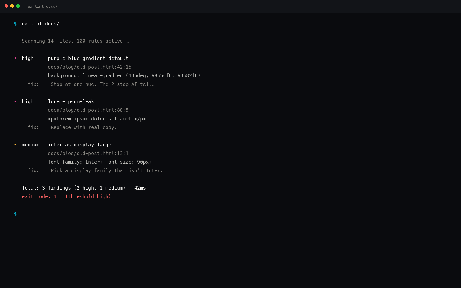
That floor is what ux-skill's anti-slop linter is: a few hundred regex rules, each tied to a specific tell, each carrying the fix. It reads your markup and CSS as raw text and flags the centroid signatures (the violet-to-blue gradient, the emoji standing in for an icon, the placeholder name, the layout transition, the missing alt text), scored out of 100 so a clean surface lands near the top and a slop-heavy one drops fast. Run it with uxskill lint. It is deterministic and offline, so the same file scores the same every time, on any machine.
What the regex floor cannot judge is the rest: whether the asymmetry is composed or just uneven, whether the type pairing has a voice, whether the density actually fits the surface. That is the taste layer, and it is what /ux-audit is for: a structured read of the surface against the parts a pattern match will never see. The split is deliberate. Let the linter own everything mechanical so the review time goes where only a person helps.
How to run it
Use the checklist as a gate, not a vibe. Lint first to clear the mechanical floor, fix what it flags, then spend the human pass on composition, voice, and fit. The order matters: there is no point debating whether the hero composition sings while the focus rings are still missing and half the states do not exist.
One pass, eight layers, every time. The tells are consistent because the centroid is consistent, which is the good news. A predictable failure is a checkable one.
pip install uxskill
# then, before you ship:
#   uxskill lint   : the mechanical floor (the regex rules above)
#   /ux-audit      : the taste layer a regex can't reach