FIELD NOTES · 2026-05-29
The accessibility holes in AI-generated UI.
Generated interfaces almost always pass the eye test. They also fail, quietly, for anyone using a keyboard, a screen reader, or a screen in sunlight. The same defects recur in every model: gray body text below the contrast floor, a focus ring switched off and never replaced, an icon button with no name, a clickable div pretending to be a control. None of it shows up in a screenshot, which is exactly why it ships.
Why the look passes and the operability does not
An AI model is trained to produce something that resembles good UI. Its reward is visual plausibility: does this look like the screenshots in the training set. Accessibility is, almost by definition, the part of an interface that is invisible in a screenshot. Contrast ratios, focus order, accessible names, the difference between a <button> and a styled <div>. None of it changes a single pixel of the rendered frame. So the optimization target never sees it, and the model has no pressure to get it right.
The result is consistent. Not random bugs, but the same short list of failures, over and over, because they are the failures that cost nothing in the one metric the model was graded on.
The interface isn't inaccessible by accident. It's inaccessible because nothing in how it was generated rewarded operability, only the look.
The recurring seven
Here is the set that shows up across tools, with the mechanism for each and the fix. Every one of these is mechanical: a fixed rule, decidable from the markup or the tokens, no judgment call required.
| defect | why it ships | the fix |
|---|---|---|
| Gray-on-white body text under 4.5:1 | Light gray reads as "refined" in a thumbnail; the ratio is invisible | Enforce 4.5:1 (AA) for body, 3:1 for large text, as a token constraint |
outline: none with no replacement | The default ring looks untidy in a static frame, so it gets removed | Pair every reset with a visible :focus-visible style |
| Icon-only control, no accessible name | The glyph carries meaning visually; a screen reader gets silence | Add an aria-label, or visually-hidden text |
Clickable <div> / <span> | A div styles identically and the click handler "works" with a mouse | Use a real <button>: focus, Enter, Space come free |
| Placeholder used as the label | It looks cleaner with one less line of text | Keep a real <label> bound to the input |
| Color as the only state signal | Red-for-error photographs fine | Add text or an icon so state survives color blindness |
| Motion with no reduced-motion guard | The animation is the demo; the guard is invisible | Wrap it in prefers-reduced-motion |
The two that read identically and behave nothing alike
The clickable-div problem is worth slowing down on, because it is the clearest case of plausible-but-broken. These two render the same and pass the eye test equally. Only one is operable.
<!-- what gets generated: looks right, broken -->
<div class="btn" onclick="save()">Save</div>

<!-- what it should be: same look, actually a control -->
<button type="button" onclick="save()">Save</button>
The first one is not keyboard-focusable, does not fire on Enter or Space, and announces nothing useful to assistive tech. The second gets all of that from the platform for free. The visual difference is zero, which is precisely why the model, graded on the visual, reaches for the div. The same logic produces the placeholder-as-label and the icon button with no name: in each case the accessible version and the broken version look the same, so the look-optimizer is indifferent between them and picks whichever was more common in its training data.
The fix is to stop treating a11y as an audit
The usual response is a manual review at the end: someone tabs through the page, runs a contrast checker, files tickets. That does not scale and it does not survive the next regeneration. The model has no memory of the audit and reproduces the same defects on the next prompt.
The opening is that almost every one of these defects is decidable from the source. You do not need to render the page or ask a human. Low contrast is arithmetic on two color tokens. A reset focus ring with no replacement is a pattern in the stylesheet. An icon button with no name, a clickable div, a placeholder standing in for a label: each is a fixed shape in the markup. So you check them the way you check syntax: deterministically, on every change, before commit.
How ux-skill encodes it
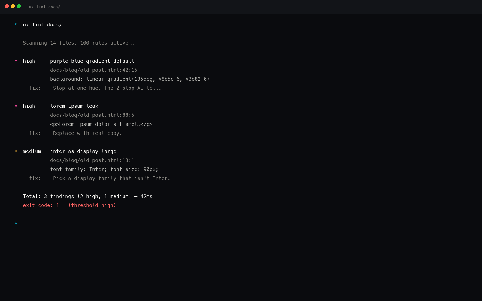
ux-skill treats these as mechanical constraints, not advice. The anti-slop linter ships rules for exactly this failure class, and it scans source text, so it fires on the markup before anything renders:
outline-none-no-focus-visible(critical): a killed focus ring with no:focus-visiblereplacement in the same block.div-onclick-no-roleandonclick-on-non-button(critical): a click handler on a non-interactive element.placeholder-as-label(high): an input leaning on its placeholder for a name.inline-svg-no-aria(high): an inline icon with no label and noaria-hidden.- reduced-motion and contrast checks that read the tokens, not the render.
Those rules are not freestanding opinions; they are the operable side of the UX-laws manifest, which carries the principles (a control must be reachable, a name must be programmatic, state must not rely on color alone) that the rules enforce. The manifest says what good means; the linter makes it decidable. And /ux-a11y runs the focused pass (contrast, focus, names, reduced motion) and hands back the specific line and the specific fix, not a vague "improve accessibility."
The point is the loop, not any single rule. Because the checks are deterministic and offline, they run on every regeneration. The model can keep producing the plausible-but-broken default; the gate catches it every time, in the same place, with the same fix, so the defect never reaches the commit.
The point
AI-generated UI fails on accessibility because it was optimized for how a screen looks, and accessibility is the part of a screen you cannot see in a picture. The answer is not a bigger manual audit. It is to treat the recurring defects as what they are (fixed, decidable rules) and check them mechanically, on every change, so a screenshot-shaped optimizer can never quietly ship a keyboard trap again.
pip install uxskill
# then, in your AI coding tool:
# /ux-a11y      : contrast, focus, names, reduced motion, per line
# uxskill lint  : the same checks, on every commit