COMPARISON · 2026-06-04
v0 vs Bolt vs Lovable: design quality compared.
All three AI app builders are genuinely fast. Describe a screen and you have running code in under a minute. The problem surfaces on day two: every screen looks like it came from the same session. This comparison examines what each builder actually produces by default, where they differ in customization ceiling, and why all three converge on the same visual vocabulary - along with what breaks the pattern.
v0, Bolt, and Lovable each produce distinct default aesthetics, but all three regress to the same centroid on an underspecified prompt: a violet or indigo primary, neutral sans-serif type, rounded cards, and marketing-page spacing applied universally. v0 has the highest customization ceiling because it generates modifiable component code. Bolt is fastest for full-stack scaffolding. Lovable has the most opinionated preset styles. None of the three consistently escapes the centroid without design constraints supplied before generation.
What this comparison covers
This is a design-quality comparison, not a feature comparison. It covers the visual output each builder produces by default, the specific tells that make that output recognizable, and how far each can be pushed with structured design direction. It does not compare pricing, deployment, backend support, or developer experience - those are well-covered elsewhere.
The criteria are practical and observable: what the default palette is, what typeface appears without instruction, what layout patterns the builder reaches for, how the output reads after five seconds of visual attention, and how well the builder responds to specific design constraints.
The criteria table
| Criterion | v0 | Bolt | Lovable |
|---|---|---|---|
| Default primary color | Violet (#7c3aed range, shadcn default) |
Indigo-to-violet gradient, slightly cooler hue | Variable preset palette; often teal or violet depending on prompt |
| Default typeface | Inter (shadcn default), occasionally Geist | Inter or system-ui, rarely deviating without instruction | Inter or a neutral geometric; sometimes DM Sans unprompted |
| Default layout | Centered hero, three-card feature row, marketing spacing | Centered hero, generous padding, section-per-feature pattern | More opinionated: sidebar or dashboard layout appears earlier; still centered hero for landing pages |
| Border radius | 8-12px on cards, 6px on inputs (shadcn defaults) | Similar to v0; rounded throughout | Slightly softer, 12-16px common; more consistently applied |
| Icon approach | Lucide React (good default - drawn SVG, not emoji) | Lucide or Hero Icons; occasionally falls back to emoji on complex prompts | Lucide or similar; rarely uses emoji as icons |
| Five-second impression | Clean, component-precise, distinctly shadcn-toned | Clean, fast, leans toward startup-generic | More polished default presentation; heavier use of gradients and blurs |
| Customization ceiling | High: generates modifiable React component code you edit directly | Medium-high: Bolt lets you modify files, but the default scaffold pushes back | Medium: preset style system is opinionated; overriding it takes explicit instruction |
| Response to specific tokens | Strong: named hex values and typefaces are respected in the output | Good: specific tokens are honored but the layout shell may not change | Variable: palette tokens work well; type pairing requires persistence |
Where they genuinely differ
v0: the component builder
v0's output is closest to raw component code. Vercel built it to generate React components that drop into a Next.js project, and the output reflects that intent: individual components are well-structured, prop interfaces are clean, and the shadcn/ui foundation means the baseline quality is high. The trade-off is that the aesthetic vocabulary is narrow: everything reads as shadcn, which means it reads as a specific palette and radius system that signals "this was built with v0" to anyone who has seen the defaults.
The ceiling for customization is the highest of the three because the code is modifiable and the component boundaries are clear. You can change the palette at the token level and it propagates. The problem is that you need to know what to change it to.
Bolt: the scaffold builder
Bolt is optimized for speed of full-stack scaffolding, and the output reflects that priority. Landing pages come out fast and hold together, but the visual vocabulary is the most generic of the three: the layout, spacing, and color choices default to the lowest-common-denominator version of "professional web app." It is harder to tell a Bolt output from a random Tailwind starter than it is with v0 or Lovable. That genericity is a design weakness but a practical feature: the output offends nobody and integrates easily into an existing project.
Lovable: the polished preset
Lovable has the most distinctive default aesthetic of the three - it has stronger opinions about gradient usage, shadow weight, and component proportion. That makes the first impression slightly better than v0 or Bolt without any extra prompting. The downside is that the opinionated defaults are harder to override: the style system has internal coherence, so a targeted change sometimes produces inconsistency rather than the intended correction. Working with Lovable's defaults is easier than against them.
The shared centroid problem
All three differences above are real, but they operate within a narrow band. The centroid for all three builders is the same because the underlying cause is structural, not tool-specific. Each uses a language model; each uses Tailwind and shadcn or equivalent component defaults; each is evaluated, implicitly, on whether the output "looks like a real app." The most defensible answer to "looks like a real app" on an underspecified prompt is the statistical average of all real apps, which is the centroid: violet primary, neutral sans, rounded cards, centered hero, marketing spacing.
An empty brief has one most-likely answer. All three builders return it. The difference between them is in which version of the same centroid they default to, not whether they escape it.
The pattern is visible in their specific defaults: all three use Inter or a functionally equivalent neutral sans; all three use a violet-to-indigo or similar "premium-technical" primary; all three produce three-card feature sections for an underspecified feature set; all three apply marketing-page spacing to application surfaces that warrant denser layout. See why AI app builders ship the same look for the mechanism in full.
What the output looks like in practice
The skiphire redesign below shows the difference between unguided generation and generation with a structured brief. The "before" side is a real example of what AI coding tools produce without design direction: a generic stock photo under a dark scrim, centered headline in a neutral sans, a "Get a Quote" CTA button in the default primary color. Functional, forgettable, and immediately recognizable as generated.
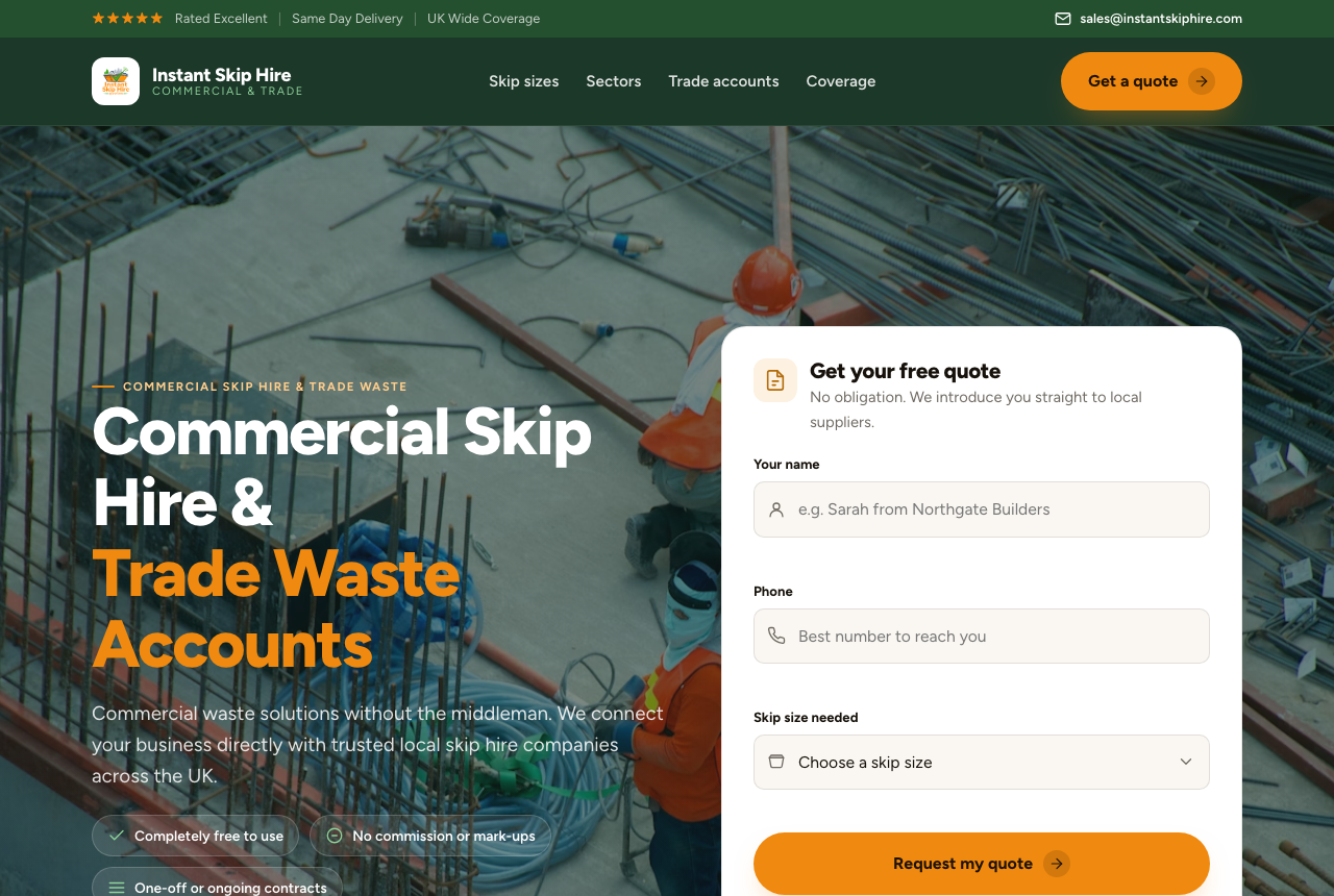
#f59e0b), quote form built into the hero. Same AI coding tool; the difference is a structured constraint brief supplied before generation.
The "after" is not a different tool or a longer prompt. It is the same generation with a constraint brief supplied first: a specific palette (#07080a canvas, #f59e0b amber accent), a display-and-body type pair instead of Inter alone, a real photograph chosen for the context rather than a stock placeholder, and an explicit instruction to put the quote form inside the hero rather than below it. Each of those choices came from a structured brief, not from re-prompting.
v0, Bolt, and Lovable each would have produced the "before" by default. With the same constraint brief, each produces something closer to the "after." The brief is the differentiator, not the builder.
How to break the centroid with any of the three
The fix is front-loading constraints, not back-loading corrections. Editing after generation means arguing with defaults that have already propagated through the component tree. Supplying constraints before generation means the builder never reaches for its defaults.
Concrete constraints that work across all three builders:
- Palette with hex values. "Use
#0a0b0das the canvas,#f59e0bas the accent, and#c8c6bffor body text" is a constraint the model can satisfy. "Dark and warm" is not - it resolves to its own centroid (dark navy, orange-ish accent, still Inter). - A named type pair. "Bricolage Grotesque for display headings, Inter for body text, no other typefaces" is unambiguous. "Editorial feel" is not.
- A density target. "Compact: 4px base, 16px component padding, 32px section gaps" prevents marketing-page spacing from landing on an application surface.
- A radius decision. "2px radius throughout, no soft cards" is a constraint. "Sharp and modern" is an adjective that resolves to teal-on-dark-navy with 8px radius.
- Component vocabulary. "Lucide icons, no emoji, no shadows, flat surfaces only" removes three centroid defaults in one instruction.
uxskill's design brief pipeline generates this constraint block from a structured intake: industry, audience, density preference, tone, and forbidden moves. The output is a paste-ready brief you supply to v0, Bolt, or Lovable before the first generation. After generation, the 152-rule linter checks the output for centroid fingerprints with a non-zero exit code on too many hits, so corrections are targeted rather than visual.
Design quality is one dimension of a builder choice. v0, Bolt, and Lovable also differ substantially on deployment workflow, database integration, authentication support, team collaboration, and pricing. This comparison says nothing about those dimensions. If design quality is the deciding factor, the honest answer is that all three are roughly equivalent on default output, v0 has the highest ceiling for customization, and none of them consistently produce distinctive work without structured constraints. That last point applies equally to Claude Code, Cursor, and every other AI coding tool.
Common questions
Which AI app builder produces the best design quality: v0, Bolt, or Lovable?
All three produce similar default output because they share the same centroid: a violet or indigo primary, Inter or a neutral sans-serif, rounded cards, and marketing-page spacing. v0 has the highest customization ceiling because it generates clean component code you can modify directly. Bolt is fastest for full-stack scaffolding. Lovable has the most opinionated preset styles. None consistently escapes the centroid without structured design constraints supplied before generation.
Why does output from v0, Bolt, and Lovable look the same?
All three are language-model-based and face the same convergence problem: an underspecified prompt has one most-likely answer, the centroid of the training distribution. They also rely on overlapping tooling - Tailwind and shadcn/ui - whose defaults (violet primary, rounded cards, Inter) narrow the output corridor further. This is not a flaw in any one tool; it is the correct behavior for a system optimizing for "plausible UI" with no further constraints.
How do I get v0, Bolt, or Lovable to produce a custom design?
Supply concrete design constraints before generation: a specific hex palette, a named typeface pair, a density target, a border radius, and component vocabulary. Adjectives like "premium" or "unique" do not work because the model resolves them to their own centroid. A structured design brief gives the builder values it can satisfy without guessing, which breaks the regression to the mean before the first line of code is written.
Does uxskill work with v0, Bolt, and Lovable?
Yes. uxskill generates a structured constraint block from a project brief: a palette, type pair, density, radius, and motion presets. You paste that block into v0, Bolt, or Lovable as the design specification, and the builder fills it in instead of inventing its own defaults. After generation, uxskill's 152-rule linter scores the output for centroid fingerprints. The combination of upfront constraints and post-generation linting removes the dependency on re-prompting.
Related reading
- Why AI-generated apps all look the same - the centroid problem explained in full
- Why v0, Bolt, and Lovable ship the same look - the mechanism behind convergence
- What is AI slop? - the definition and nine visible signs
- The 152 anti-pattern rules - the linter reference